Web Active: A Fresh Look for a Tech-Forward Hosting Company

Client
Web Active
Completed
2025-05-15
Overview
Together, we reimagined the brand's digital presence with a focus on clarity, personality, and usability without losing sight of speed and performance.
Overview
Here's something that rarely happens in web design projects: Web Active came in 23% under budget and ahead of schedule. Not because we cut corners or reduced scope, but because we used a process I've been refining for years: live prototyping directly in the browser.
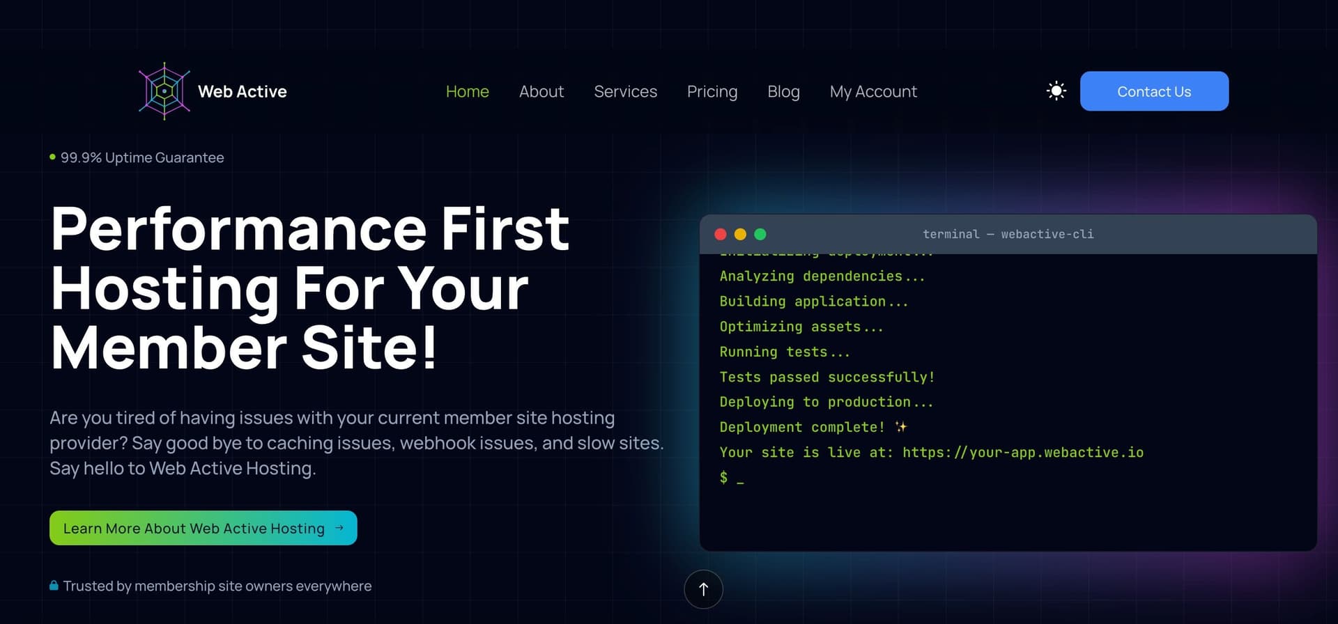
Web Active is a web hosting company specializing in high-performance hosting for course creators and membership sites. When they approached me in 2025 for a complete website redesign and brand refresh, they had specific goals: modernize their visual identity, improve user experience, add dark mode support, and create custom animations that reflected their technical sophistication. Standard stuff for a design project, but the timeline was tight and the budget was fixed.
Instead of following the traditional process (static mockups in Figma, multiple revision rounds, handoff to development, then discovering things that don't work in real browsers), I proposed starting with live prototypes using WordPress and Bricks Builder. Design and build simultaneously, test interactions in real time, make decisions with actual data about how things perform. The client was skeptical at first, but willing to try.
The result? A complete brand refresh with custom animations, full dark/light mode support, and a responsive design system delivered 23% under budget. The live prototyping process eliminated the usual friction points: no "it looked different in the mockup" conversations, no discovering animation timing issues after development, no accessibility problems that weren't caught until QA. Everything was tested in real browsers, on real devices, from day one.
Problem
Web Active had a problem many successful technical companies face: their product was excellent, but their website didn't fully reflect that. They had already established themselves as a leading hosting solution for membership sites and course creators, with a strong reputation for quality service. Their existing site was functional and had served them well, but as the company grew, they needed their digital presence to better reflect the premium quality of service they were known for.
The specific challenges:
The existing site, while functional, needed a refresh to match the company's evolution. The visual hierarchy could be strengthened to help potential customers quickly understand what made Web Active different. The branding had room to be more distinctive and aligned with their premium positioning. There was no dark mode, which felt like a missed opportunity for a tech-savvy audience. And overall, the site needed to visually communicate the level of technical sophistication their customers actually experienced once they signed up.
But here's the trickier challenge: Web Active needed this done quickly and within a specific budget. They couldn't afford a six-month design process with multiple agencies. They needed someone who could move fast, make decisions confidently, and deliver something that worked in real browsers, not just in mockups.
The traditional process problem:
Most web design projects follow a predictable, wasteful workflow:
- Design static mockups in Figma for weeks
- Present to stakeholders, iterate based on feedback
- Hand off "finished" designs to developers
- Discover that animations don't feel right, interactions are confusing, or responsive breakpoints break the design
- Go back to design, revise, hand off again
- Repeat until budget runs out or everyone is exhausted
This process inflates timelines and costs because you're making decisions based on static images, not real experiences. You can't test how a dark mode toggle actually feels until it's built. You can't know if an animation is too fast or too slow from a Figma prototype. You can't catch accessibility issues in a mockup.
I proposed a different approach: skip the static mockups entirely and prototype directly in the browser. Design and code simultaneously, test everything in real time, make decisions based on how things actually work, not how they look in a design tool.
I'd been refining this live prototyping process for years. I knew it would be faster, more efficient, and result in a better final product. They agreed to try.
Solution
The live prototyping process:
Instead of starting in Figma, I built directly in WordPress using Bricks Builder with Automatic.css. This combination gave me the perfect balance: the flexibility to design custom layouts and interactions while maintaining the structure and content management benefits of WordPress. Automatic.css provided a systematic way to globalize styles, ensuring consistency across components without writing repetitive CSS. But this wasn't "design in the browser" in the messy, unstructured way that phrase sometimes implies. It was intentional, systematic, and collaborative.
Week 1: Brand foundation and visual direction
I created a shared Notion workspace where the Web Active team and I collected visual inspiration, competitive references, and strategic direction. We defined the brand personality: technical but approachable, modern but trustworthy, sophisticated but not cold. This gave us clear parameters without locking us into specific visual executions.
I designed the logo refresh in Figma because logos need precision and vector scalability. But once the logo was approved, everything else happened in Bricks Builder. I built a basic style guide page with typography options, color palette variations, and spacing systems. All live, all testable in different browsers and devices. Bricks Builder's visual editor allowed me to design while seeing the actual output, and WordPress's flexibility meant the client could easily update content later.
The team could immediately see how the typography performed at different sizes, how the colors worked in light and dark contexts, and how the spacing felt on real screens. We made decisions in hours, not days.
Week 2-3: Component library and homepage
With the visual foundation set, I started building reusable components in Bricks Builder: navigation, buttons, cards, form inputs, footers. Bricks Builder's class-based system made it easy to create consistent, reusable elements that could be applied across the entire site. Each component was designed to work in both light and dark modes from the start, not as an afterthought. I tested the dark mode toggle immediately, refined the transition timing using custom CSS and JavaScript, and made sure all color combinations met accessibility contrast requirements.
The homepage came together as a series of sections using these components. The Web Active team could see the actual site taking shape in real time. When we discussed animation timing for scroll effects, I'd adjust the code in Bricks, refresh the page, and they could feel the difference immediately. No guessing, no "we'll see how it looks when it's built." We were already building it on their actual WordPress installation.
Week 4: Additional pages and refinement
With the homepage working as a template, the other pages came together quickly. Pricing, features, about, contact. Each one used the established component library, maintaining consistency without requiring additional design work.
The animations were tuned throughout. Subtle scroll effects that revealed content as you moved down the page. Hover states on pricing cards that felt responsive but not jumpy. A smooth, non-jarring dark mode toggle that transitioned colors gracefully. All of this was tested and refined in real browsers, not prototyped in a tool that approximates how things might work.
The final system:
- Modernized logo with flexible variations for different contexts
- Dual-mode color system optimized for accessibility in both light and dark themes
- Typography hierarchy that works across all screen sizes with careful attention to readability
- Custom JavaScript animations for scroll effects, hover interactions, and mode transitions
- Component-based architecture making future updates straightforward
- Performance-optimized with semantic HTML, efficient CSS, and minimal JavaScript
Everything was tested on real devices throughout the process. Responsive breakpoints were adjusted based on actual content, not arbitrary screen widths. Accessibility was verified with screen readers and keyboard navigation from day one.
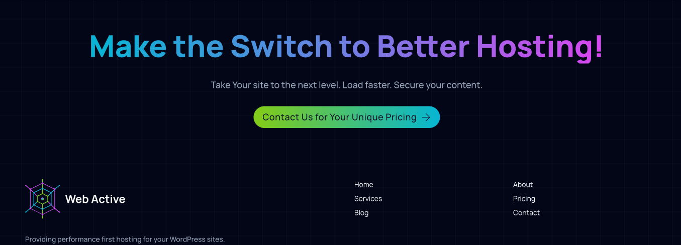
Clear Call to Action
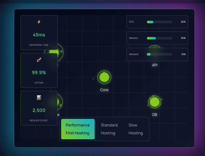
Solution Animations
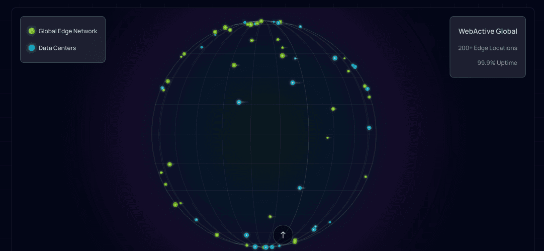
Interactive Animation
Key Insights
Why the live prototyping process worked:
The traditional design-then-build workflow creates natural inefficiencies. Every handoff between design and development is an opportunity for miscommunication, revision, and rework. Every static mockup that doesn't account for real browser behavior leads to surprises during development.
Live prototyping eliminates most of these friction points:
Immediate feedback on real performance: When we discussed animation timing, I didn't need to approximate it in a prototyping tool. I adjusted the actual JavaScript, and the Web Active team felt the difference immediately. We made animation decisions in minutes instead of going through revision cycles.
No design-development gap: There was no "what we designed" versus "what got built" problem because they were the same thing. The client reviewed working code, not mockups. What they approved was exactly what launched.
Faster decision-making: When choosing between typography options or color combinations, the team saw them in the actual context they'd be used. Not in an isolated Figma frame, but on a real page with real content. This made decisions faster and more confident.
Earlier detection of problems: Accessibility issues, responsive breakpoint problems, and performance concerns were caught and fixed during design, not discovered during QA. This saved massive amounts of revision time.
The specific example that saved time:
The dark mode implementation is a perfect example. In a traditional workflow, I would have designed separate light and dark versions of each page in Figma. The client would have reviewed static mockups. Then during development, we would have discovered issues: colors that looked fine in isolation didn't have enough contrast in context, the toggle transition felt jarring, some elements didn't have dark mode states defined.
Instead, I built the dark mode system from day one. The client tested it on their own devices, in different lighting conditions, and gave feedback based on actual usage. We refined the toggle animation timing, adjusted color values for better contrast, and ensured every component worked in both modes. All of this happened during "design," not as post-development fixes.
The collaboration dynamic:
Working this way also changed the client relationship. Instead of formal presentation meetings where I defended design decisions, we had collaborative work sessions where we experimented together. "What if we made this animation slower?" I'd adjust it live, and we'd see immediately if it felt better. This created trust and partnership rather than the typical designer-client power dynamic.
Results
The number that matters: 23% under budget.
When web design projects come in under budget, it's usually because scope was cut or shortcuts were taken. Web Active came in under budget with expanded scope. We delivered everything planned plus additional refinements we had time to add because the process was so efficient.
The traditional workflow would have looked like this:
- Week 1-2: Design mockups, present, revise
- Week 3-4: Finalize designs, hand off to development
- Week 5-6: Development discovers issues, goes back to design
- Week 7-8: Revisions, QA, more revisions
- Week 9-10: Final fixes, launch preparation
What actually happened:
- Week 1: Brand foundation established, live style guide built
- Week 2-3: Components built, homepage completed, tested across devices
- Week 4: Additional pages completed using established components
- Week 5: Polish, refinement, and additional features we had budget for
By week 5, we were done. Not because we rushed, but because the live prototyping process eliminated the back-and-forth that typically consumes project timelines. The client had already been reviewing and approving working code throughout. There was no handoff phase, no discovery of surprises, no QA catching problems that should have been caught during design.
What the client got:
- A complete brand refresh with modernized logo and visual identity
- Fully functional dark/light mode with smooth transitions
- Custom animations tuned to feel responsive without being distracting
- Component-based architecture that makes future updates straightforward
- Accessibility-tested, performance-optimized site that works across all browsers and devices
- A design system they can use for future pages and features
Beyond the budget savings:
The real value wasn't just financial. The Web Active team gained confidence in the design because they'd been testing it in real contexts throughout the process. There was no moment of "I hope this looks good when it's built" because they'd already seen it built. The launch was anticlimactic in the best way: we just flipped the switch because everything had already been tested and approved.
The site launched with strong positive feedback from both the Web Active team and their customers. The dark mode was particularly appreciated by their technical audience. The animations added polish without feeling gimmicky. And the overall brand positioning now matched the quality of their hosting services.
Visit the live site: webactive.io →
Learnings
Live prototyping isn't for every project, but when it works, it's transformative.
This process works best when:
- The client trusts the designer to make good decisions quickly
- The project scope is clear enough that you're refining execution, not exploring multiple directions
- You have the technical skills to design and code simultaneously
- The timeline is tight enough that efficiency matters
It doesn't work well when:
- The client needs extensive stakeholder approvals (static mockups are easier to circulate)
- The project direction is still undefined (exploration requires lower-fidelity tools)
- The team isn't comfortable reviewing work-in-progress code
What I learned about selling this approach:
Clients are skeptical because it sounds too good to be true. "You're going to design and build at the same time and it'll be faster?" Yes, but only if they trust the process. The key is managing expectations: the early work looks rough because it's functional code, not polished mockups. You need clients who can evaluate substance over aesthetics initially.
I now start with a small prototype to prove the concept. Build one section or component live, show how much faster decisions happen when you can test the real thing, then expand from there. Once clients experience the difference between "this mockup looks nice" and "this actually works in my browser on my phone," they get it.
What surprised me:
The collaborative dynamic improved dramatically. In traditional projects, design presentations feel adversarial: the designer defends choices, the client critiques them, someone "wins" each decision. Live prototyping turned this into experimentation: "Let's try both and see which feels better." The client stopped being a critic and became a collaborator.
This also eliminated the "I thought it would look different" problem that plagues design handoffs. Because the client had been reviewing working code throughout, there were no surprises at launch. What they approved during development was exactly what went live.
The broader implication:
This project validated something I've believed for years: the design-development separation is artificial and wasteful. It made sense when designers worked in print and developers worked in code, but web design is code. Separating the two creates unnecessary friction.
Not every designer needs to be a developer, and not every developer needs design skills. But projects move faster and produce better results when the person making design decisions understands the medium they're designing for. Designing directly in the browser isn't "skipping the design phase." It's designing with better tools.
The lasting impact on my practice:
Web Active proved that live prototyping can deliver better results in less time with lower costs. That's rare in our industry. Most improvements in one area come at the expense of another: faster but lower quality, cheaper but slower, better but more expensive. Live prototyping improved all three simultaneously.
I now lead with this approach for projects where it fits. Not because it's trendy or different, but because it consistently produces better outcomes for clients. The 23% under budget result isn't an anomaly. It's what happens when you eliminate the inefficiencies built into traditional design processes.
Every project since Web Active, I reference this case study when clients ask about timeline and budget. "Here's what happened when we skipped the mockup phase and built live." The number speaks for itself. 23% under budget isn't a cost-cutting measure. It's what efficiency looks like.