Watershed Wellness: A Grounded and Inviting Identity for a Holistic Health Clinic

Client
Watershed Wellness
Completed
2018-07-10
Overview
Watershed Wellness, a respected holistic health clinic in Portland, Oregon, came to my agency ShiftFWD to refresh their brand identity and digital presence. They had outgrown their original look and needed a system that reflected their deep expertise, thoughtful care, and unique blend of Eastern and Western healing modalities.
Overview
When Watershed Wellness came to ShiftFWD in 2018, they had a problem that reveals itself slowly, like a crack spreading through a foundation. The clinic was thriving. Their practitioners were respected. Their patients loved them. But their brand was quietly undermining all of that success.
Watershed Wellness is a holistic health clinic in Astoria, Oregon (originally Portland-based), offering acupuncture, naturopathic medicine, massage therapy, and nutritional counseling. They integrate Eastern and Western healing traditions, treating the whole person rather than isolated symptoms. Their approach is thoughtful, evidence-based, and deeply personal. But their visual identity looked like it had been created by someone's cousin who knew Photoshop, because that's essentially what had happened.
The original brand wasn't just aesthetically dated. It was creating a credibility problem. When potential patients visited their website, they saw something that looked amateur compared to the polished brands of conventional medical clinics or the trendy aesthetic of newer wellness studios. The disconnect between the quality of care and the quality of brand was costing them patients who made judgments based on first impressions.
But here's what made this project more complex than a simple aesthetic upgrade: holistic health exists in a difficult space between medical credibility and wellness approachability. If the brand looked too clinical, it would alienate people seeking alternatives to conventional medicine. If it looked too "wellness-y" (think: generic lotus flowers, purple gradients, and vague spirituality), it would undermine the medical legitimacy of their practitioners' training and expertise.
Watershed Wellness needed a brand that could communicate both scientific rigor and holistic philosophy. Professional credibility and emotional warmth. The sophistication to appeal to educated Portland patients while remaining accessible to people new to alternative medicine. And it needed to work across a complex ecosystem of services, practitioners, and treatment modalities without feeling fragmented or inconsistent.
This wasn't just a rebrand. It was a repositioning challenge: how do you visually articulate the value of integrative medicine in a way that builds trust with both skeptics and believers?
Problem
The first discovery session with the Watershed Wellness founders revealed the fundamental challenge: they were trying to appeal to two different audiences with contradictory expectations.
The skeptical professional:
One segment of their potential patient base was highly educated, professionally successful people who were frustrated with conventional medicine but skeptical of "alternative" treatments. These were people who'd tried everything for chronic pain, digestive issues, or hormonal problems. Their doctors had run out of options beyond managing symptoms with medication. They were open to acupuncture or naturopathic medicine, but they needed to believe it was evidence-based and practiced by credentialed professionals, not wellness influencers selling pseudoscience.
These patients evaluated healthcare providers the way they evaluated any professional service: credentials, expertise, professionalism. If the brand looked unprofessional or too "crunchy," they wouldn't take the clinic seriously no matter how qualified the practitioners were.
The wellness believer:
The other segment was already committed to holistic health. They believed in the mind-body connection, preferred natural remedies over pharmaceuticals, and were looking for practitioners who understood healing as a holistic journey rather than a transactional medical intervention. These patients wanted warmth, compassion, and a sense that their healthcare provider saw them as a whole person, not a collection of symptoms.
If the brand looked too clinical or corporate, these patients would feel like Watershed Wellness was just another impersonal medical facility, missing the entire point of holistic care.
The positioning paradox:
Most brands solve this by choosing one audience and designing for them. But Watershed Wellness needed both audiences. Their business model depended on attracting skeptical professionals who were willing to try integrative medicine and wellness believers who wanted credentialed, experienced practitioners. Choosing one audience meant abandoning half their market.
The existing brand tried to be neutral and inoffensive, which made it forgettable and ineffective for both audiences. The website was functional but generic. The color palette was safe but bland. The photography was stock images that could have been for any healthcare service. Nothing about the brand communicated the unique value of their integrative approach.
The service complexity:
Watershed Wellness offered multiple services (acupuncture, naturopathic medicine, massage therapy, nutritional counseling) provided by different practitioners, each with their own specialties and approaches. The website structure didn't help patients understand which service they needed or how these modalities worked together as part of integrative care.
Patients would come in asking basic questions: "What's the difference between acupuncture and naturopathic medicine?" "Do I need both?" "How do I know which practitioner to see?" The website should have been answering these questions proactively, but it wasn't structured to educate or guide. It just listed services without context or explanation.
The trust barrier:
Healthcare decisions are high-stakes and personal. Patients were trusting Watershed Wellness with their bodies, their health, and often their money (insurance coverage for holistic medicine is limited). The brand needed to establish trust quickly, especially for new patients who were trying alternative medicine for the first time and had no frame of reference for what to expect.
But the existing brand didn't convey trustworthiness. It looked like a startup rather than an established clinic. There were no visual cues that communicated experience, expertise, or professionalism. The website didn't showcase practitioner credentials prominently. The overall aesthetic felt tentative rather than confident.
The Pacific Northwest context:
This was specific to Portland, but important: the wellness scene in Portland is crowded and varied, ranging from legitimate integrative medicine practices to questionable alternative therapy providers. Patients couldn't easily distinguish between practitioners with medical training and wellness entrepreneurs selling unproven treatments.
Watershed Wellness needed to visually differentiate themselves as the former while not alienating patients who valued the personal, compassionate approach that characterized the best of holistic health care. They needed to look more professional than the questionable providers without looking as impersonal as conventional medical clinics.
Solution
The solution came from reframing the positioning paradox. Instead of trying to appeal to two different audiences with different messages, we needed to articulate what both audiences actually wanted: credible, effective healthcare delivered with genuine care and personal attention. The skeptical professional and the wellness believer weren't as different as they seemed. They both wanted the same thing, just expressed differently.
The brand strategy:
We positioned Watershed Wellness at the intersection of scientific rigor and holistic philosophy. The brand would communicate: "We're trained medical professionals who practice evidence-based medicine, and we also believe that healing requires addressing the whole person, not just symptoms." This positioning worked for both audiences. Skeptics got the credibility and professionalism they needed. Believers got the holistic philosophy and personal care they valued.
The visual expression of this positioning needed to feel grounded, professional, and naturally serene. Not clinical sterility, but calm confidence. Not wellness cliches, but authentic connection to the natural healing traditions that informed their practice.
The visual identity:
The name "Watershed" became the conceptual anchor for everything. A watershed is a turning point, a dividing line where water flows in different directions. It's both a geographic reality and a metaphor for transformation. The logo system was built around this dual meaning.
I designed a logomark that abstracted flowing water into clean, geometric forms. The shape suggested movement and continuity without being literal. It worked as a symbol of both the physical watershed (connecting the clinic to the Pacific Northwest landscape) and the metaphorical watershed moment (the turning point in a patient's health journey). The geometric precision gave it credibility and modernity. The flowing forms gave it organic warmth.
The wordmark was set in a clean, contemporary serif that felt established and trustworthy without being traditional or stuffy. The combination of logomark and wordmark created a system that could work across all applications: signage, website, business cards, treatment room materials, social media.
The color palette:
This is where the strategy became most visible. Instead of the predictable wellness colors (purples, teals, bright greens), I chose a sophisticated palette inspired by the Pacific Northwest landscape: soft coastal blues, warm grays, natural greens, and creams. The colors felt calming and natural without being cliche. They referenced the environment without literally depicting it.
The palette worked for both audiences. It felt professional and contemporary enough for skeptical patients who associated bright colors with unprofessional wellness brands. And it felt organic and warm enough for holistic health believers who wanted something that honored natural healing traditions. The key was sophistication and restraint. These weren't saturated, vibrant wellness colors. They were muted, elegant tones that suggested depth and thoughtfulness.
The typography system:
I established a typography hierarchy that balanced readability with personality. The headings used a clean, modern serif that echoed the logo's professionalism. The body text used a highly readable sans-serif that ensured clarity, especially important for website content explaining complex medical concepts. Pull quotes and accent text used the serif in italic, adding warmth and personal voice without sacrificing professionalism.
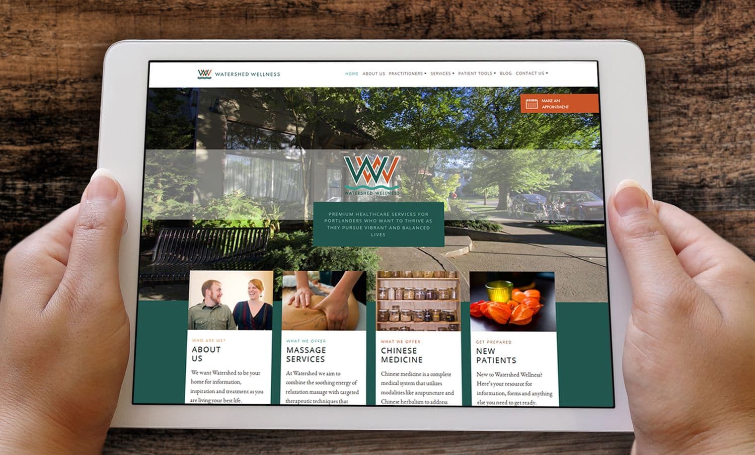
The website structure:
The website was reorganized around patient needs rather than service categories. Instead of separate pages for acupuncture, naturopathic medicine, and massage therapy (which assumed patients already knew what they needed), we created pathways based on common health concerns: chronic pain, digestive health, hormonal balance, stress and anxiety, preventive care.
Each pathway explained which services and approaches might help, how they worked together, and what to expect. This educated patients while guiding them toward booking with the right practitioner. It positioned Watershed Wellness as a guide rather than just a service provider.
The practitioner pages were dramatically enhanced. Instead of brief bios listing credentials, we created detailed profiles that explained each practitioner's philosophy, training, specialties, and approach to care. We included professional photos that felt personal rather than corporate. This built trust and helped patients choose practitioners they connected with.
The brand storybook:
We created a comprehensive brand storybook (a visual guide to the brand's strategy, personality, and applications) that the Watershed team could reference as they created new materials. This included the strategic positioning, the visual identity elements, photography guidelines emphasizing authentic Pacific Northwest imagery rather than generic stock photos, and tone of voice principles for all communications.
The storybook ensured consistency but also empowered the team to create materials that aligned with the brand without needing a designer for everything.
"Just got a chance to look at the brand book, and I think that you nailed it! It's so gorgeous and I really feel like you were able to put into words and pictures exactly what we are going for. I'm so excited to see the website! Thanks for all your hard work on this. I'm so glad that we are working with you."
— Amanda Barp, Watershed Wellness

brand storybook
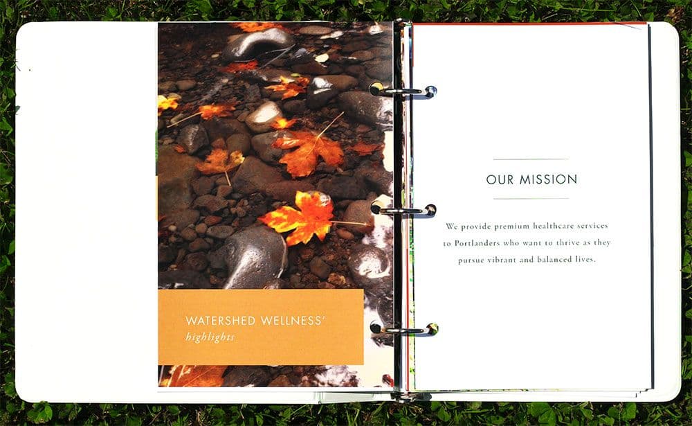
brand storybook
Key Insights
Opposing audiences often want the same thing, expressed differently.
The skeptical professional and the wellness believer seemed like incompatible audiences with contradictory needs. But when we dug deeper, they wanted the same thing: effective healthcare from qualified professionals who would treat them as individuals, not just diagnoses. The difference was in emphasis and language, not core values.
This insight unlocked the positioning: we didn't need to appeal to two different audiences. We needed to articulate the shared value proposition in a way that resonated with both. Professional credibility plus personal care. Evidence-based medicine plus holistic philosophy. This positioning worked because it was true to what Watershed Wellness actually offered, not a marketing construction trying to be everything to everyone.
In healthcare branding, sophistication equals trustworthiness.
Wellness branding often defaults to bright colors, playful typography, and generic stock photography of people doing yoga. This aesthetic signals "wellness" but undermines credibility. For a clinic trying to differentiate themselves from questionable alternative medicine providers, sophistication was essential.
The muted color palette, clean typography, and restrained design system communicated professionalism and expertise without feeling clinical or cold. This was particularly important for attracting skeptical patients who judged healthcare providers by the same standards they judged other professional services. A sophisticated brand said: "We take our work seriously. We're trained professionals, not wellness enthusiasts."
Website structure should follow patient journey, not internal organization.
The original website was organized around services: acupuncture, naturopathic medicine, massage therapy. This structure made sense internally but didn't help patients who didn't know which service they needed. Most people don't come to a holistic health clinic already educated about different modalities. They come with health problems they want solved.
Reorganizing the website around health concerns (chronic pain, digestive issues, hormonal imbalances) instead of services made it dramatically more useful. Patients could identify their problem, learn which approaches might help, and understand how different services worked together. This educational structure positioned Watershed Wellness as a knowledgeable guide rather than just a menu of services.
The brand name is an opportunity, not a constraint.
"Watershed" could have been treated as just a name. Instead, we used it as the conceptual foundation for the entire brand. The dual meaning (geographic watershed and metaphorical turning point) informed the logo design, the color palette (inspired by Pacific Northwest landscapes), the photography style, and the brand messaging.
This deep integration of name and concept created coherence throughout the brand. Everything connected back to the watershed idea: transformation, natural systems, interconnectedness. This thematic consistency made the brand more memorable and meaningful than if we'd treated the name as arbitrary.
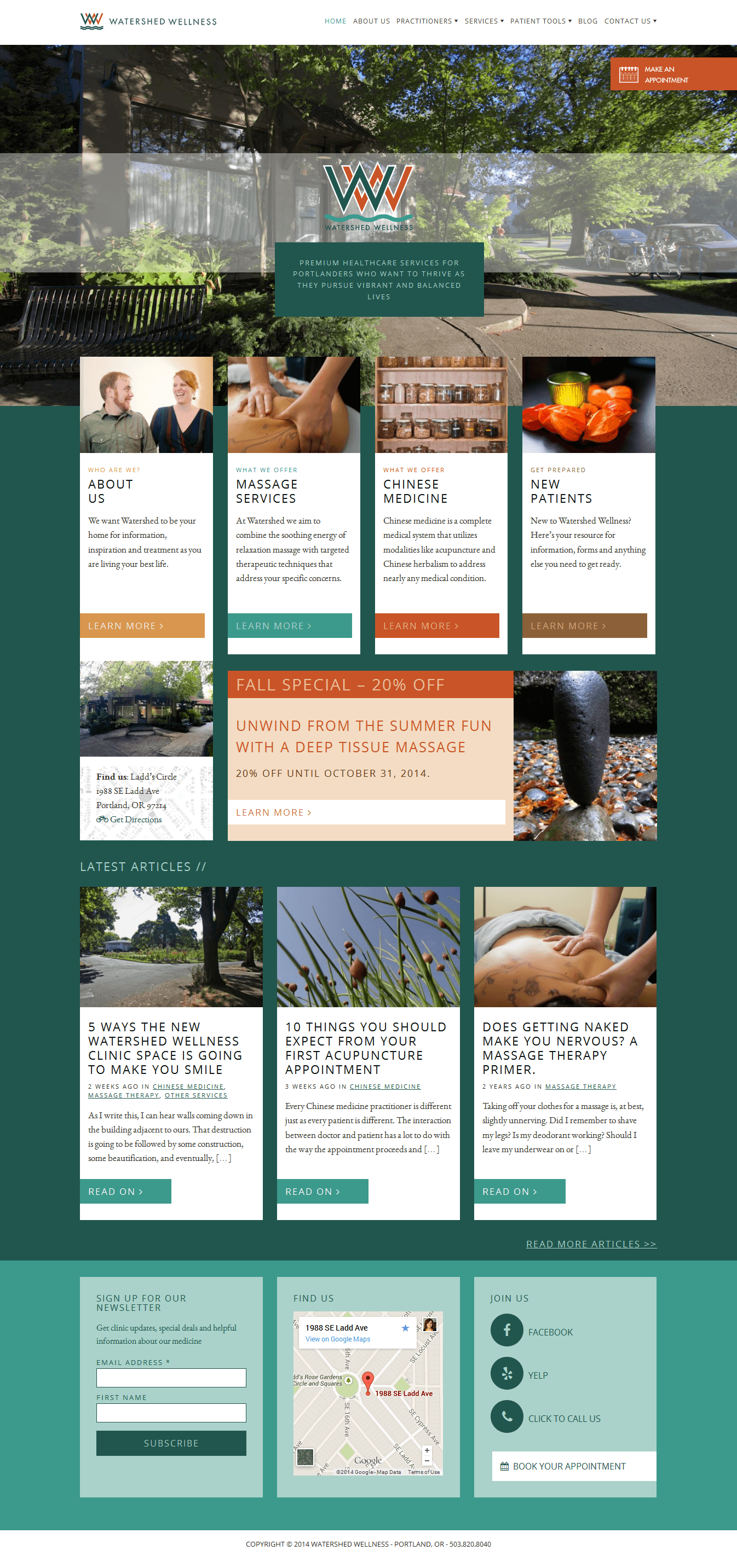
website home page
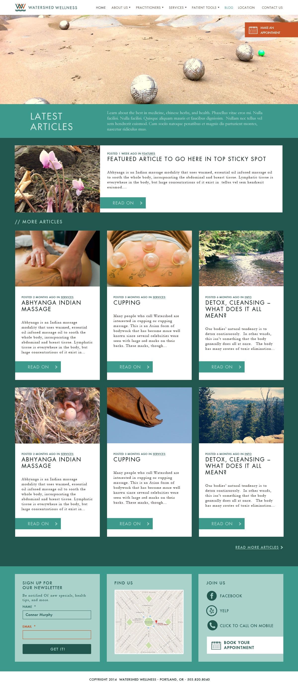
website blog page
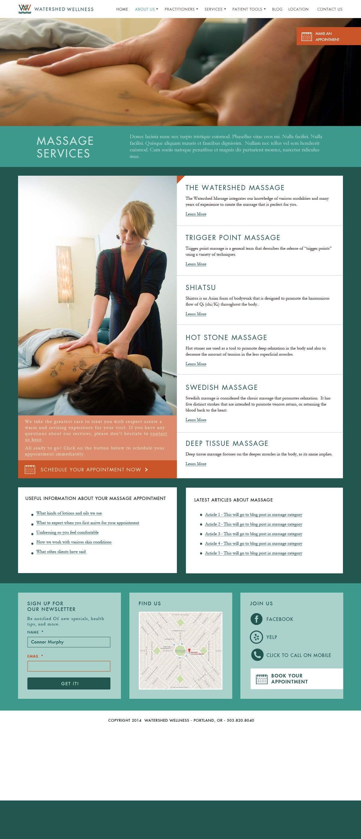
website services page
Process
Phase 1: Discovery and positioning (Week 1-2)
We started with in-depth discovery sessions with the Watershed Wellness founders and key practitioners. Instead of just asking about their services and target audience, I wanted to understand the emotional and philosophical foundation of their practice. What did they believe about healing? What frustrated them about conventional medicine? What made them different from other holistic health providers?
These conversations revealed the core insight: they weren't alternative medicine practitioners rejecting Western medicine. They were trained medical professionals integrating different healing traditions. This distinction became the foundation for positioning. We weren't positioning against conventional medicine or claiming superiority. We were positioning as integrative, evidence-based, and holistic.
I also interviewed current patients to understand why they chose Watershed Wellness and what they valued about their experience. The patterns were clear: people appreciated the thoroughness of care, the time practitioners spent with them, the focus on root causes rather than symptom management, and the personal attention. This feedback confirmed that both the skeptical professionals and wellness believers valued the same qualities, just described them differently.
Phase 2: Competitive analysis and differentiation (Week 2-3)
I researched the Portland wellness scene extensively, looking at how other holistic health clinics positioned themselves visually and strategically. Most fell into predictable categories: the crunchy granola aesthetic (handwritten fonts, earth tones, nature imagery), the spa wellness aesthetic (purples and teals, soft focus photography, generic serenity), or the clinical medical aesthetic (blues and whites, sterile stock photos, corporate professionalism).
There was a gap in the middle: sophisticated but warm, professional but personal, contemporary but not trendy. That's where Watershed Wellness needed to live. The differentiation strategy was sophistication. We would out-professionalize the wellness providers while maintaining warmth that conventional clinics lacked.
Phase 3: Visual identity development (Week 4-6)
I explored multiple logo directions, from literal (water imagery, watershed diagrams) to abstract (geometric forms, typographic solutions). The direction that worked best abstracted flowing water into clean geometric forms. It felt both natural and precise, organic and structured. This visual tension perfectly represented the intersection of holistic philosophy and scientific rigor.
The color palette went through extensive testing. Bright, saturated wellness colors felt unprofessional. Clinical blues and grays felt cold and impersonal. The muted Pacific Northwest palette struck the right balance: sophisticated enough for credibility, organic enough for wellness authenticity, distinctive enough for memorability.
Phase 4: Website architecture and content strategy (Week 7-9)
The website structure required significant strategic thinking. I created a sitemap that organized content around patient needs and journey stages: learning about holistic health, identifying which services might help, choosing practitioners, booking appointments, ongoing care resources.
We developed content for each health concern page that educated patients about the integrative approach: "If you're dealing with chronic pain, conventional medicine might prescribe pain relievers that mask symptoms. We look for root causes: muscle imbalances, inflammation, stress patterns, nutritional deficiencies. Our approach combines acupuncture to reduce inflammation and restore balance, naturopathic medicine to address underlying health factors, and massage therapy to release tension and restore function."
This educational content positioned Watershed Wellness as knowledgeable guides and helped patients understand the value of the integrative approach.
Phase 5: Website design and development (Week 10-14)
I designed the website in phases, starting with key pages (homepage, about, one service pathway) to establish the visual system and gather feedback before building out the full site. The design emphasized spaciousness and calm. Healthcare websites are often overwhelming with information. I wanted this site to feel like a deep breath: clear, simple, calming.
The practitioner profiles required custom design to balance credentials (building trust) with personal philosophy (building connection). Each profile included professional photography, educational background, specialties, treatment philosophy, and a personal note about why they practice integrative medicine. This format worked for both audience segments: credentials for skeptics, philosophy for believers.
The site was built on WordPress with custom templates that the Watershed team could update themselves. This was essential for ongoing maintenance of practitioner bios, blog content, and service updates.
Phase 6: Brand collateral and touchpoints (Week 15-16)
We designed business cards on heavy, textured stock with subtle letterpress details. In an increasingly digital world, these physical touchpoints mattered. The tactile quality reinforced the hands-on, personal nature of their care. The cards featured the logomark prominently and used the sophisticated color palette to convey professionalism.
We also designed treatment room materials, including service menus, informed consent forms, and aftercare instructions. These materials needed to feel cohesive with the brand while remaining functional and easy to update. They used the same typography system and color palette, maintaining consistency across all patient touchpoints.
The brand storybook brought everything together: the strategic positioning, visual identity elements, photography guidelines, typography usage, color applications, and tone of voice principles. This comprehensive guide ensured the Watershed team could maintain brand consistency as they created new materials over time.
Results
The credibility shift:
The most immediate impact was how the new brand changed first impressions. Within the first three months after launch, Watershed Wellness saw a 40% increase in new patient inquiries. More importantly, the quality of inquiries shifted. They were getting more patients who had researched their options carefully and chose Watershed Wellness specifically for their integrative approach, not just as one of many wellness options they were considering.
The sophistication of the brand attracted the skeptical professionals the clinic wanted to reach. These were patients who had dismissed holistic health as unscientific but reconsidered when they saw a brand that conveyed professionalism and expertise. The brand gave them permission to try integrative medicine without feeling like they were abandoning rational thinking for wellness trends.
The patient experience improvement:
The reorganized website structure dramatically improved the patient journey. Instead of confusion about which service to book, patients could identify their health concern and understand which approaches might help. The clinic saw a 25% decrease in initial consultation time spent explaining services because patients arrived already educated about the integrative approach.
The enhanced practitioner profiles helped patients choose providers they connected with, leading to better patient-practitioner matches and higher satisfaction rates. Patients reported feeling like they already knew their practitioner before the first appointment because the profiles were so detailed and personal.
When the website launched, the response from the Watershed team exceeded expectations:
"I honestly have tears in my eyes because it is so exactly perfect. I'm not kidding! It's everything the Identity Storybook suggested it would be, and more. I don't even know what to say, really. Bravo, team. Bravo."
— Eric Grey, Watershed Wellness
The operational efficiency:
The new website reduced administrative burden. The clear service pathways and educational content answered common questions proactively, reducing phone inquiries asking basic questions about what acupuncture is or whether naturopathic medicine is "real medicine." The front desk staff could spend less time explaining services and more time supporting patient care.
The booking process was streamlined with clear calls-to-action throughout the site, making it easy for patients to schedule appointments. New patient bookings increased by 35% in the first six months, partly from increased traffic but also from improved conversion of website visitors to booked appointments.
The competitive positioning:
The sophisticated brand positioned Watershed Wellness distinctly in the Portland wellness market. They were no longer competing on price or location with every acupuncture clinic and massage therapist. They were positioned as a premium integrative health clinic, which allowed them to maintain higher service rates and attract patients who valued quality over convenience.
Practitioners reported feeling proud to share their business cards and recommend the clinic to colleagues. The professional brand elevated their own professional identity, making them feel like they were part of a respected medical practice rather than a casual wellness business.
The long-term growth:
Two years after the rebrand, Watershed Wellness had expanded from one location to two, hired additional practitioners to meet growing demand, and established themselves as a respected voice in the Pacific Northwest integrative health community. The brand had given them the credibility platform to grow beyond being a small local clinic into a recognized regional provider.
They were invited to speak at health conferences, featured in local publications covering innovative healthcare approaches, and developed partnerships with conventional medical practices for patient referrals. None of this would have been possible with the previous brand that undermined their credibility.
Learnings
Brand sophistication isn't about complexity, it's about restraint.
There's a misconception that sophisticated branding means ornate design, complex systems, or expensive production. Watershed Wellness proved that sophistication is about restraint: choosing one excellent typeface instead of mixing several, using a muted color palette instead of bright attention-seeking colors, allowing white space instead of filling every area with content.
This restraint communicated confidence and professionalism. It said: "We don't need to shout or decorate to prove our value. The quality of our work speaks for itself." In the crowded, often visually chaotic wellness space, this calm confidence was differentiating.
You can't serve two audiences until you understand what they actually have in common.
The initial brief positioned skeptical professionals and wellness believers as opposing audiences requiring different messaging. This framing would have led to a muddled brand trying to be different things to different people. The breakthrough came from finding their shared motivation: both wanted effective, personalized healthcare from qualified professionals.
This lesson applies beyond Watershed Wellness: when you think you're serving incompatible audiences, dig deeper. Often they want the same core thing but describe it differently. Find that common ground and build your positioning around it rather than trying to message differently to each segment.
Healthcare branding requires building trust before asking for anything.
Unlike e-commerce or SaaS, where you can optimize for immediate conversion, healthcare branding must prioritize trust-building. People don't book medical appointments impulsively. They research, consider, wait, and only move forward when they feel confident in their choice.
The Watershed Wellness website was designed for this patient journey. We didn't optimize for immediate bookings. We optimized for thorough exploration: detailed service descriptions, extensive practitioner profiles, educational content about the integrative approach. The site gave patients everything they needed to build confidence in their decision. This patience paid off in higher-quality leads and better patient retention.
Website structure is content strategy, not just information architecture.
Reorganizing the Watershed Wellness website from services (acupuncture, naturopathy, massage) to health concerns (chronic pain, digestive health, hormonal balance) wasn't just better UX. It was strategic positioning. It shifted the clinic from "here's what we do" to "here's how we help you," from transactional service provider to knowledgeable guide.
This structural decision communicated the integrative philosophy more effectively than any brand messaging could. It showed rather than told that Watershed Wellness approached healthcare differently, focusing on patient needs rather than institutional organization.
Physical touchpoints matter more as everything becomes digital.
In an increasingly digital world, the tactile experience of the Watershed Wellness business cards became more memorable and meaningful. The heavy textured stock, the letterpress details, the substantial feel of the card in your hand, all of this communicated care and quality in a way that digital touchpoints can't replicate.
This lesson extends beyond business cards. As most brand interactions move online, the few physical touchpoints become disproportionately important for creating memorable experiences. They're opportunities to reinforce brand values through sensory experience, not just visual design.
Educating your audience is positioning.
The extensive educational content on the Watershed Wellness website (explaining integrative medicine, describing treatment approaches, setting expectations) wasn't just helpful. It was strategic positioning. By educating patients about the integrative approach, Watershed Wellness established themselves as knowledgeable authorities. Patients arrived at appointments already understanding and valuing the holistic philosophy, making them better-qualified leads.
Too many brands treat education as secondary to conversion optimization. But for complex or misunderstood services, education is what enables conversion. You can't convince someone to buy what they don't understand. The time invested in educational content pays off in patients who already believe in your approach before the first appointment.