The Bookish Fox: Whimsical Branding & Website Design for a Book-Loving Copywriter

Client
The Bookish Fox
Completed
2019-10-19
Overview
Sarah Fox—an intuitive, book-loving copywriter and editor—approached me to help reposition her brand, The Bookish Fox, into something more magical, professional, and emotionally resonant. I led the full rebranding effort, including brand strategy, visual identity, and a custom WordPress website.
Overview
When Sarah Fox reached out in 2019, she had a problem many service providers face: her work was excellent, but her brand didn't reflect that yet. She was a copywriter and editor specializing in helping authors bring their books to life, but her website and visual identity were built between client projects when she had time.
Sarah knew she was ready for the next level, but she was nervous. She'd invested in DIY courses and spent countless hours trying to get her brand "right" on her own. Nothing felt quite like her. Everything was either too corporate (making her feel stiff and inauthentic) or too whimsical (making her worry she wouldn't be taken seriously by professional authors).
The Bookish Fox needed to walk a specific tightrope: magical without being childish, professional without being boring, warm without being unprofessional. It needed to appeal to authors who were overwhelmed by the publishing process and looking for a guide who understood both the craft of writing and the business of books.
This was more than a website redesign. Sarah needed a complete brand repositioning that would give her the confidence to charge what she was worth and attract the kinds of clients she actually wanted to work with. She was ready to invest in her business at a new level, but she didn't want to lose the personality and warmth that made her different from other editors and copywriters in the space.

Problem
The first conversation with Sarah revealed the core tension: she loved the name "The Bookish Fox" and the whimsical, literary vibe it suggested, but she was worried it made her seem unprofessional or hobby-level. Her existing brand had personality, but she felt it wasn't quite landing the way she wanted. She needed something that maintained the warmth while elevating the professionalism.
But here's what made this project interesting: Sarah's hesitation about whimsy was actually her superpower. The authors she worked with weren't looking for corporate efficiency. They were creative people writing books about things they cared deeply about. They wanted an editor who understood the emotional journey of writing, not just someone who fixed grammar.
The discovery process:
I started with a brand strategy workshop, but not the typical "tell me about your target audience" conversation. I asked Sarah about her favorite books, what made her fall in love with editing, and the moments in client projects where she felt most alive. I wanted to understand not just who she served, but why.
What emerged was a clear pattern: Sarah saw herself as a guide for authors navigating the overwhelming world of publishing. Her clients came to her feeling lost, doubting their work, unsure if their book was good enough. She helped them see what was working, fix what wasn't, and move forward with confidence. She wasn't just editing words. She was holding space for the emotional experience of bringing a book into the world.
Then I reviewed her client testimonials. The pattern was striking. Words like "warm," "supportive," "felt seen," "understood my vision," "made me feel like a real author" appeared repeatedly. Not a single testimonial mentioned turnaround times or competitive pricing. Everything was about the emotional experience and the quality of guidance.
The competitive landscape:
I researched other editors and copywriters in the book publishing space. Most fell into predictable categories: ultra-professional with minimal personality (lots of navy blue, generic serif fonts, corporate headshots), or overly cutesy (illustrated characters, playful language that felt more suited to children's book illustrators than serious authors).
There was a gap in the middle: professional enough to be taken seriously, warm enough to be approachable, magical enough to honor the creative process. That's where The Bookish Fox needed to live.
The core insight:
Sarah's ideal clients were authors who felt like imposters. They were writing their first book, or struggling with their second, or questioning whether their work mattered. They needed someone who understood the craft of writing but also the vulnerability of sharing your work with the world. The brand needed to say: "I see you, I understand what you're going through, and I can help you make your book better without making you feel like a failure."
The whimsy wasn't a liability. It was differentiation. But it needed to be sophisticated whimsy, not childish whimsy. Literary magic, not cartoon silliness.
Solution
The brand strategy was straightforward: lean into the whimsy, but make it sophisticated. Position Sarah as a guide for the creative and emotional journey of publishing, not just a technical service provider. The visual identity needed to feel like stepping into a cozy library where magic was real but also where serious work happened.
The visual identity:
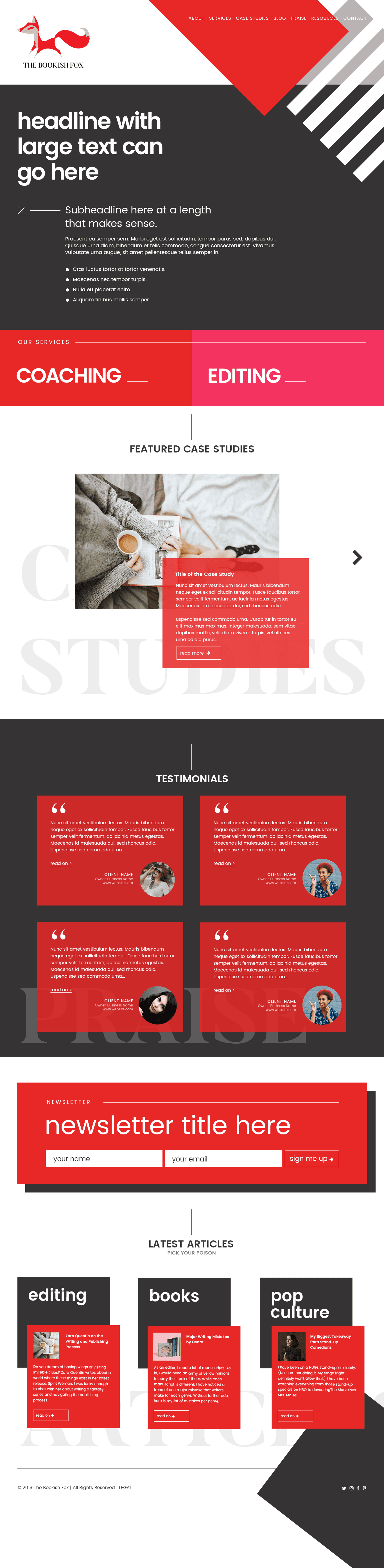
The logo became the anchor for everything. The fox concept was a natural fit, not just for the literary associations but because Sarah's last name is Fox. This personal connection made the brand name feel authentic and memorable. I evolved the existing fox concept to a more refined direction. The new version was more elegant, with clean lines and a subtle personality. It could sit on a business card next to a traditional publishing house and hold its own, but it still had warmth and character. The fox became a symbol of guidance and cleverness, referencing the literary tradition of animal guides in classic literature while also being a personal connection to Sarah herself.
The typography balanced this perfectly. I chose a decorative serif for the main wordmark that felt literary and established, the kind of font you'd see in a beautifully typeset novel. But I paired it with a clean, modern sans-serif for body text that ensured readability and kept things from feeling too old-fashioned. The combination said: "I respect the craft and tradition of publishing, but I'm not stuck in the past."
The color palette was where we really diverged from the competition. Most editors and copywriters in the space used predictable, safe colors: navy blue, gray, maybe a muted teal. Professional but forgettable. I chose a rich, warm color scheme built around deep teals, warm golds, and soft creams. The colors felt like a library at sunset, cozy and inviting but still sophisticated. Every color was chosen to work together harmoniously while maintaining accessibility contrast requirements.
The website architecture:
The website needed to do several things simultaneously: establish credibility, explain services clearly, address the emotional needs of potential clients, and guide them toward booking a consultation. Most service provider websites prioritize one of these at the expense of the others. We needed to balance all four.
The homepage opened with a headline that spoke directly to the emotional state of Sarah's ideal client: authors who felt overwhelmed and unsure. Not "Professional editing services for authors" but something that acknowledged the vulnerability of the creative process. The copy I wrote for the hero section was: "You wrote a book. Now what?" followed by subtext that positioned Sarah as the guide who understood both the craft and the emotions of publishing.
The services were organized not by what Sarah did (developmental editing, copyediting, etc.), but by what clients needed: "You're not sure if your manuscript is ready," "You need help shaping your story," "You want someone to catch every typo before it's too late." This reframing made it easier for clients to self-identify and understand which service they needed. Technical editing terms mean nothing to first-time authors. Problems they recognize and want solved? That's what gets conversions.
The testimonials were featured prominently but strategically. Instead of a generic testimonial section at the bottom of the page, we integrated client quotes throughout the site in context. On the "About" page, testimonials about Sarah's warmth and empathy. On service pages, testimonials about the specific outcomes of that service. This made the social proof feel more authentic and relevant rather than performative.
The emotional architecture:
This is the part of the project that doesn't show up in screenshots but made the biggest difference. Every page was designed to acknowledge and address a specific emotional state. The "About" page wasn't just Sarah's credentials (though those were there). It was the story of why she became an editor, what she believes about writing and publishing, and why she cares about helping authors through this process. It positioned her as someone who understood the emotional journey because she'd been on it herself.
The contact page didn't just have a form. It had reassurance. "Not sure if you're ready to hire an editor? Let's talk anyway. Sometimes the most valuable thing I can do is help you figure out your next step, even if that's not working with me." This removed the pressure and fear that stops so many potential clients from reaching out. It positioned Sarah as generous and trustworthy, not just transactional.
The service pages included pricing. This was a strategic decision. Many service providers hide pricing because they're afraid it will scare people away. But hiding pricing creates anxiety and wastes time on consultations with people who can't afford your services anyway. Sarah's prices were fair and within market range. Showing them upfront filtered for qualified leads and built trust. It said: "I'm not trying to trick you. Here's what it costs. If that works for you, let's talk."
The content strategy:
The website included a blog, but we positioned it strategically. This wasn't just "content marketing" for SEO. It was thought leadership that reinforced Sarah's positioning. We planned a content calendar around the questions her clients asked repeatedly: "How do you know when your manuscript is ready for an editor?" "What's the difference between developmental editing and copyediting?" "How do you choose the right editor for your book?"
Each post was designed to be genuinely helpful, not just a thinly veiled sales pitch. Sarah wanted to build trust and authority by actually helping people, even if they never hired her. This aligned perfectly with her values and differentiated her from competitors who only created content to manipulate SEO.

Key Insights
Whimsy is only a problem when it's not paired with substance.
Sarah was worried that "The Bookish Fox" sounded too playful, too unprofessional. But the real problem wasn't the whimsy. It was that her previous branding didn't balance whimsy with credibility. When you pair warmth and personality with clear expertise and professional polish, the whimsy becomes an asset. It makes you memorable and approachable instead of forgettable and intimidating.
Her clients weren't looking for corporate efficiency. They were creative people working on deeply personal projects. They wanted someone who understood the emotional experience of writing, not just someone who could fix grammar. The whimsy signaled: "I understand that writing is magic, and I respect that." The sophistication signaled: "But I'm also a professional who will make your book better."
Pricing transparency builds trust faster than anything else.
Including pricing on the website was controversial. Sarah was nervous. "What if people think I'm too expensive? What if I scare them away?" But hiding pricing doesn't protect you from price-sensitive clients. It just wastes everyone's time. You end up having consultations with people who can't afford you, or worse, people who feel tricked when they finally learn the price.
Showing pricing upfront does three things: it filters for qualified leads, it builds trust by being transparent, and it positions your services as valuable rather than negotiable. When you hide your pricing, you signal that it's flexible or that you're not confident in your value. When you show it clearly, you signal: "This is what it costs because this is what it's worth."
After launching the site with visible pricing, the quality of consultation inquiries improved significantly. The people who reached out were already pre-qualified and ready to invest.
Organizing services by client need, not service type, makes conversion easier.
Service providers often organize their offerings by what they do: "Developmental Editing," "Copyediting," "Proofreading." These are industry terms that mean something to professionals but nothing to clients. First-time authors don't know the difference between developmental editing and copyediting. They just know their manuscript needs help.
When we reframed services by client problems ("Your story isn't quite working," "You need to polish your prose," "You want to catch every error before publishing"), conversion improved dramatically. Clients could immediately identify which service solved their problem without needing to learn industry terminology or make the wrong choice.
This seems obvious, but most service providers never do it. They organize their services the way they think about their work, not the way clients think about their problems.
Emotional reassurance is as important as service descriptions.
The most valuable addition to the website wasn't the beautiful design or the clear service descriptions. It was the emotional reassurance woven throughout every page. Writers are vulnerable. They've spent months or years working on something deeply personal, and they're terrified it's not good enough. When they visit an editor's website, they're not just evaluating services. They're asking: "Will this person make me feel like a failure?"
Every page included language designed to address this fear. "Your book is already good. I'm here to help you make it even better." "Not sure if you're ready? Let's talk anyway." "Writing a book is hard. You don't have to do it alone." These small reassurances made potential clients feel seen and safe, which is what actually drives conversions for service-based businesses built on trust.
The design choices supported this too. Warm colors, comfortable typography, friendly imagery. Everything said: "This is a safe space." Not in a therapeutic way, but in a "you won't be judged here" way.
Process
Phase 1: Strategy and discovery (Week 1-2)
We started with a brand strategy workshop, but I approached it differently than typical discovery sessions. Instead of asking Sarah to describe her target audience in demographic terms, I wanted to understand the emotional journey her clients were on. I asked questions like: "What do your clients feel the moment before they decide to hire you?" "What's the fear they're not saying out loud?" "What's the transformation they're really seeking?"
This revealed the core insight that shaped everything: Sarah's clients felt like imposters. They'd written something but weren't sure if they were "real" authors. They needed someone who would validate their work and help them improve it without making them feel incompetent. This became the emotional foundation of the entire brand.
I also reviewed all her client testimonials and looked for patterns. The words "warm," "supportive," "understood my vision," "made me feel like a real author" appeared repeatedly. Not a single testimonial mentioned price or turnaround time. Everything was about the emotional experience and feeling seen. This confirmed that the brand needed to lead with empathy and understanding, not efficiency or affordability.
Phase 2: Visual identity development (Week 3-4)
With the strategy clear, I moved into visual design. I created multiple moodboards exploring different approaches: corporate and professional (which Sarah had been trying to force herself into), overly whimsical (which she was afraid of), and sophisticated whimsy (which was the right answer).
The sophisticated whimsy board included references to classic book cover designs, vintage library aesthetics, and modern editorial layouts. Rich colors, elegant typography, and illustrations that felt literary rather than cartoonish. When Sarah saw it, she immediately relaxed. "This is it. This feels like me but elevated."
I designed the new logo with this direction in mind. The fox illustration went through several iterations to find the right balance: recognizable as a fox, friendly but not childish, sophisticated but still warm. I paired it with a custom wordmark using a serif font that felt established and literary.
The color palette was carefully chosen. Deep teal as the primary color (literary, trustworthy, calm), warm gold as an accent (optimism, creativity, warmth), and soft cream as the background color (approachable, comfortable, not stark white). Every color was tested for accessibility contrast and emotional resonance.
Phase 3: Website design and content development (Week 5-8)
I designed the website in InDesign, starting with the homepage. The layout needed to establish credibility quickly while also making visitors feel welcome. The hero section introduced Sarah with a headline that spoke to her clients' emotional state, followed by a brief value proposition, then social proof (a standout testimonial), and finally a clear call-to-action.
The service pages went through multiple iterations. Initially, they were organized by editing type (developmental editing, copyediting, proofreading). Sarah understood these terms, but testing with potential clients revealed confusion. We reorganized by client need: "Your story isn't working yet," "Your writing needs polish," "You're ready to catch final errors." This reframing made everything clearer.
I wrote much of the website copy myself because the tone was critical. Sarah's natural writing voice was warm and supportive, but she kept second-guessing herself and adding corporate language that felt stiff. I gave her permission to sound like herself. "You're not a corporation. You're a person helping people. Write like you talk to clients." The copy became conversational, reassuring, and confident without being arrogant.
Phase 4: Development and content migration (Week 9-10)
The site was built on WordPress using a flexible theme framework that would allow Sarah to update content easily without breaking the design. I custom-coded several elements to match the design precisely: the navigation, the testimonial layouts, the service page templates, and the blog structure.
We migrated her existing blog content and optimized it for SEO. Many of her older posts were excellent but had weak titles and no clear structure. I rewrote headlines to be more specific and useful ("How to Know If Your Manuscript Is Ready for an Editor" instead of "Editing Tips"), added subheadings for scannability, and ensured each post had a clear call-to-action that aligned with her services.
Phase 5: Launch and refinement (Week 11-12)
The site launched with a soft announcement to her email list and existing clients. We monitored analytics and gathered feedback for the first two weeks, then made small refinements. The most significant change was adjusting the homepage hero section to include a secondary headline that made Sarah's specific expertise clearer (adding "for fiction and memoir authors" to clarify her niche).
We also refined the contact form after noticing that people were writing long, apologetic messages explaining why they weren't sure if they were ready to hire an editor. This confirmed our strategy was working (people felt safe being vulnerable), but it also revealed an opportunity. I added a note above the form: "Not sure if you're ready? That's okay. Let's talk anyway." This reduced the anxiety and increased form submissions.
Results
The immediate impact:
After launching the new brand and website, Sarah's business transformed. The most dramatic change was in lead quality. The new brand attracted more aligned clients: authors who were ready to invest, understood her pricing, and felt emotionally connected to her approach.
The consultation-to-client conversion improved significantly. This wasn't because Sarah changed her sales process. It was because the website was doing the filtering and trust-building work before prospects even reached out.
The pricing confidence shift:
Before the rebrand, Sarah struggled with pricing conversations. She'd quote her rates and then immediately offer discounts or payment plans, worried that clients would think she was too expensive. The new brand gave her confidence. The professional polish and clear positioning said "premium service," which made the pricing feel justified. Clients stopped negotiating and started accepting her rates as fair for the value provided.
The rebrand repositioned her from "freelance editor trying to make a living" to "trusted expert who guides authors through publishing." That shift in positioning made her pricing feel not just acceptable, but expected for the level of expertise she offered.
The referral effect:
The brand also changed how clients talked about Sarah. The memorable brand name and distinct personality made her easier to recommend: "You need to work with The Bookish Fox. She's this amazing editor who really understands authors." The stronger brand made Sarah more likely to be remembered when someone needed editing services.
The website engagement told a clear story. People weren't just landing on the homepage and leaving. They were reading service pages, browsing blog posts, and spending time getting to know Sarah through the content. This deeper engagement translated directly into more qualified leads and better conversions.
The confidence factor:
But the most important result wasn't quantifiable. Sarah's confidence transformed. After the rebrand, she felt proud to share her brand. The professional brand gave her the credibility platform to present herself with confidence in her field.
The lasting business impact:
The rebrand enabled Sarah's business to grow significantly. She was able to charge more per project and be more selective about clients, building a strong editing practice that continues to serve authors today.
The professional rebrand wasn't just about looking better. It was about building the credibility infrastructure that allowed her to grow into the business she wanted. Years later, Sarah continues to use this brand identity, a testament to its longevity and effectiveness. The design has stood the test of time because it was built on strategic foundations rather than fleeting trends.
Learnings
Service provider branding is fundamentally about emotional positioning, not visual differentiation.
Most service providers approach branding as a visual problem: "I need a better logo and a prettier website." But that's not the real challenge. The real challenge is emotional positioning. How do you make someone feel safe enough to trust you with something vulnerable (in Sarah's case, their manuscript)? How do you communicate competence without feeling cold or intimidating?
The visual identity matters, but only as a vehicle for the emotional positioning. The Bookish Fox succeeded because every design decision supported the emotional strategy: "I'm warm and approachable, but I'm also a professional who will make your work better." The colors, typography, copy, layout, everything reinforced that positioning. Too many service providers treat branding as decoration instead of strategy, and they end up with pretty websites that don't convert because they're not addressing the actual emotional barriers preventing clients from hiring them.
Transparency eliminates more objections than any sales technique.
Sarah was nervous about including pricing on her website. She thought it would scare people away. But hiding information creates anxiety and distrust. When you're transparent about pricing, process, what to expect, and who you're a good fit for, you eliminate most of the objections that stop people from hiring you.
After adding pricing, Sarah's consultation-to-client conversion improved significantly. Not because the pricing was lower (it wasn't), but because the people who booked consultations were already pre-qualified. They knew what it cost, decided it was worth it, and showed up ready to move forward. The consultations became conversations about fit and process, not sales pitches defending the price.
This extends beyond pricing. Being transparent about what you're good at (and what you're not) builds trust. Sarah was clear that she specialized in fiction and memoir, not business books or academic writing. This didn't limit her business. It made her more attractive to the right clients because they knew she was an expert in their specific genre.
Most service providers organize their offerings wrong.
This is one of those insights that seems obvious once you see it but almost nobody does it: organize your services by the problems you solve, not by what you do. Sarah was organizing her services the way she thought about her work (developmental editing, copyediting, proofreading), but clients didn't understand those terms. They just knew they had a problem: "My story isn't quite working," or "I need to polish my writing."
When we reorganized the service pages by client problems instead of editing types, conversions improved immediately. Clients could self-identify which service they needed without needing to learn industry terminology or worry about making the wrong choice. This seems like a small change, but it's actually a fundamental shift in how you think about your business: from "here's what I do" to "here's how I help you."
The personality traits you're afraid to show are often your strongest differentiators.
Sarah was afraid that "The Bookish Fox" sounded too whimsical and unprofessional. She'd been trying to make herself sound more corporate and serious. But the whimsy wasn't a bug. It was a feature. In a competitive space full of serious, professional editors with navy blue websites and corporate headshots, the warmth and literary charm of The Bookish Fox made her memorable.
This is a pattern I've seen repeatedly: service providers try to fit into what they think professional looks like, which usually means mimicking the blandest, safest version of their industry. But bland and safe is forgettable. The personality traits you're nervous about showing (warmth, humor, creativity, quirkiness) are often exactly what would make you stand out in a sea of sameness. The key is pairing personality with competence. Whimsy alone isn't professional. Whimsy plus clear expertise and professional polish is differentiation.
There's a time for DIY and a time to invest professionally.
Sarah had put significant effort into building her initial brand herself. She'd taken courses, watched tutorials, and built what she could with the resources she had. That got her started and helped her build a client base. But there came a point where she was ready to invest at a different level.
The professional rebrand unlocked new growth. The investment in professional branding paid for itself as Sarah was able to grow her business and increase her rates. This isn't an argument that everyone needs expensive branding from day one. It's a recognition that for service providers competing on credibility and trust, there's a strategic time to invest in your brand as infrastructure rather than treating it as decoration. The DIY approach works when you're starting out, but at a certain point, investing professionally can remove growth bottlenecks.
The work isn't done when the website launches.
The initial launch was successful, but the real value came from treating the brand and website as living systems, not finished products. We refined the messaging based on actual client feedback, adjusted the service offerings as Sarah's business evolved, and improved the conversion path based on analytics data. The contact form copy change (adding "Not sure if you're ready? That's okay. Let's talk anyway.") came from observing how people were using the form and addressing the hesitation we saw in their messages.
Too many designers treat branding as a one-time deliverable: you get a logo, a website, and maybe some business cards, and then you're done. But effective branding is iterative. You launch with a strong foundation, then you refine based on real-world results. The best insights about what's working and what's not come from watching how actual clients interact with your brand, not from theoretical strategy sessions.