ShiftFWD: Brand Strategy & Design for Visionary Clients

Client
ShiftFWD
Completed
2019-01-01
Overview
ShiftFWD was a boutique creative agency I co-founded with my former partner, dedicated to helping visionary businesses clarify their identities and bring their brands to life with strategy, storytelling, and design.
Overview
Here's the uncomfortable truth about starting a creative agency: you're excellent at helping clients clarify their brands, but when it comes to your own, every decision feels paralyzing. You overthink everything because you know too much. You second-guess choices that would be obvious if you were advising someone else. And you face the classic consultant's dilemma: your best work goes to clients, leaving your own brand cobbled together in whatever time remains.
That was exactly where my partner Koldo Barroso and I found ourselves with ShiftFWD. We'd been working together since 2002, helping clients with brand strategy, identity design, and digital experiences. What started as Intuitive Designs in 2003 evolved significantly over nearly two decades:
The Evolution:
- 2003-2011: Web design agency named Intuitive Designs
- 2011: We renamed the agency ShiftFWD and focused on Conversion Rate Optimization and Consulting
- 2012: We expanded into UX Consulting by offering audits and heuristic analysis
- 2014-2019: We focused more heavily on brand strategy and consulting
By the time we were ready to invest in our own brand, we had a methodology that worked, satisfied clients, and referrals keeping us busy. But we didn't have a cohesive agency brand. We had a name, a basic logo I'd designed in an afternoon, and a portfolio site that was functional but uninspired.
The irony wasn't lost on us. We were preaching the importance of brand strategy and intentional positioning to clients while our own agency lacked both. Potential clients would ask about our process, and we'd explain it beautifully. Then they'd look at our website and see something that didn't reflect that strategic depth. The disconnect was undermining our credibility.
But here's why this project is worth documenting: building your own agency brand when you're already skilled at branding is a fundamentally different challenge than client work. You can't achieve the objectivity you bring to client projects. Every design decision carries emotional weight because it represents your professional identity. You can't separate ego from strategy because your ego is part of what you're branding.
We knew we needed to treat ourselves like a client, go through our own process with the same rigor we applied to client work, and create a brand that actually reflected the quality and thoughtfulness of what we delivered. This wasn't just about looking more professional. It was about building the infrastructure that would allow the agency to grow beyond two freelancers taking whatever work came along to a structured practice attracting the right clients for the right reasons.
The challenge was building an agency brand that could do several things simultaneously: attract mission-driven clients who valued strategic depth, showcase our work without overshadowing client projects, communicate our process in a way that built trust without being self-aggrandizing, and establish a visual identity strong enough to be memorable but flexible enough to adapt as the agency evolved.
This is the story of how we finally practiced what we preached.
Problem
The first problem was admitting we had a problem. For months, we'd been telling ourselves the agency brand was "good enough for now" and that we'd refine it when we had time. But that time never came. Client work always took priority, which meant our own brand remained perpetually unfinished.
The credibility gap:
The existing ShiftFWD brand created a credibility problem we didn't want to acknowledge. When we reached out to potential clients or were referred to them, they'd visit our website to evaluate us. What they saw was functional but generic: a basic portfolio grid, minimal case study descriptions, and a visual identity that looked hastily assembled. For clients seeking strategic, thoughtful branding, this was a red flag.
We were losing opportunities to agencies with more polished brands, even when our actual work was stronger. Clients couldn't see the quality of our thinking from the website. They saw surface-level portfolio pieces without understanding the strategic depth behind them. And they judged us accordingly.
The positioning confusion:
We hadn't clearly defined who we were for. Our portfolio included everything from e-commerce brands to wellness clinics to creative professionals. This breadth made us look like generalists taking any project that came along rather than specialists with a distinct point of view. Potential clients couldn't tell if we were the right fit for their needs because we weren't clearly positioned around any specific expertise or clientele.
This lack of focus also affected the quality of inquiries we received. We'd get requests for quick logo designs from startups with minimal budgets alongside inquiries from established businesses seeking comprehensive brand strategy. We were attracting everyone, which meant we were attracting no one specifically.
The process invisibility:
Our branding process was sophisticated. We'd developed what we called the "ID Discovery Process," a structured approach to uncovering a client's core identity and translating it into brand strategy and visual design. This process was our competitive advantage. It's what created transformative results for clients and why they referred others to us.
But the process was invisible on our website. We mentioned it briefly, but we didn't explain how it worked or why it mattered. Potential clients saw the final designs but had no understanding of the strategic thinking that produced them. This made our work look like aesthetic execution rather than strategic problem-solving, which undervalued what we actually offered.
The portfolio presentation problem:
The existing portfolio was a simple grid of project images with minimal context. Potential clients could see what we'd designed but had no understanding of the problems we'd solved or the strategic thinking behind the work. The shallow presentation made our work look decorative rather than strategic. Clients who valued design thinking couldn't evaluate whether we were capable of the depth they needed.
The emotional weight:
Here's the part that's harder to quantify but equally important: we didn't feel proud sharing our own brand. When clients asked for our website, we'd send it with a mental disclaimer: "This doesn't represent our best work." When we spoke at conferences or networking events, we'd avoid prominently displaying our logo because it felt unfinished.
This lack of pride affected our confidence in business development. We were hesitant to proactively reach out to dream clients because we knew our brand didn't reflect our capabilities. We were relying entirely on referrals rather than actively building the client base we wanted.
The infrastructure gap:
Beyond the public-facing brand, we lacked the internal infrastructure that would allow the agency to scale. We didn't have standardized onboarding materials, documented processes, or systematic ways of working. Every project started from scratch. This inconsistency made it difficult to bring on contractors or collaborators because we couldn't easily communicate how we worked.
The absence of this infrastructure meant the agency's capacity was limited by our personal involvement in every detail. We couldn't grow without getting overwhelmed.
Solution
The solution started with something we'd been avoiding: treating ourselves exactly like we'd treat a client. We blocked out three weeks on the calendar with no client work. This was financially painful but necessary. We couldn't keep building our brand in the margins. It needed dedicated, focused time.
The positioning work:
We went through our own ID Discovery Process, which felt awkward and revealing in ways client discovery sessions never do. We asked each other the uncomfortable questions we'd ask clients: What do we actually believe about branding? Who do we want to work with? What transformation do we create? What makes us different from other agencies?
The breakthrough came from examining our best client projects and identifying patterns. The clients we loved working with weren't defined by industry. They were mission-driven people building businesses around something they cared deeply about. They valued strategic thinking over aesthetic trends. They were willing to invest time and money in doing branding right rather than looking for quick, cheap solutions.
This insight clarified our positioning: ShiftFWD was for mission-driven businesses seeking brand clarity and strategic depth. We weren't for everyone. We were specifically for clients who understood that branding is strategic work, not just visual decoration. This focus immediately made our messaging clearer and our target audience more specific.
The visual identity:
The name "ShiftFWD" already contained our positioning: helping clients move forward with intention. The visual identity needed to express this without being heavy-handed. I redesigned the logo from scratch, exploring dozens of directions before landing on a clean, geometric mark that suggested forward movement through its angular form.
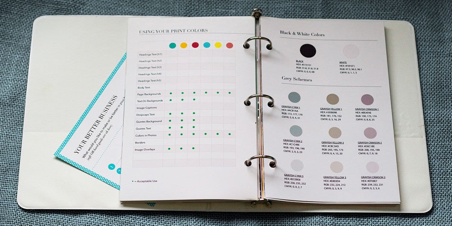
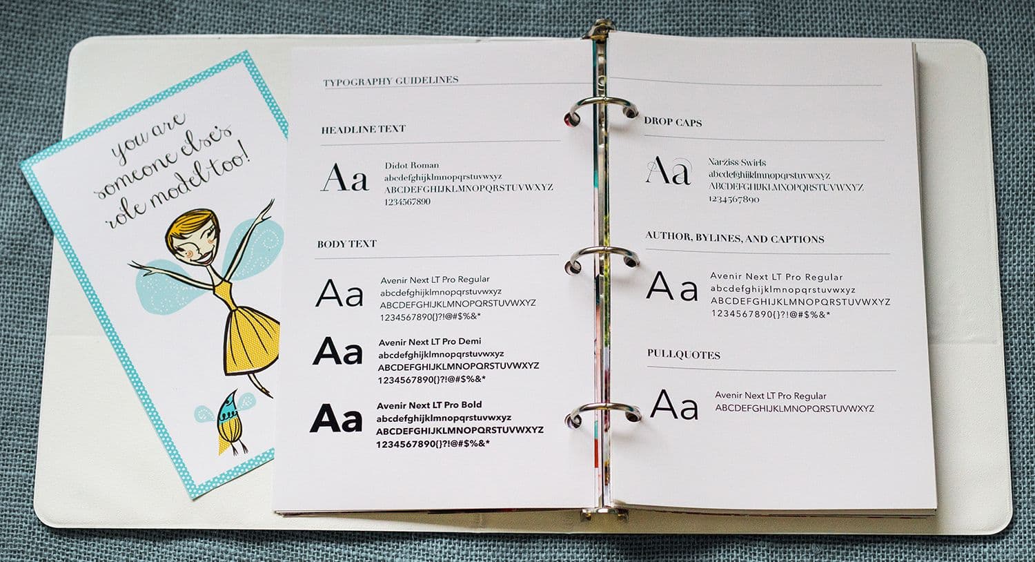
The typography was deliberately simple and modern. We chose two typefaces: a clean geometric sans-serif for headlines that felt contemporary and confident, and a readable serif for body text that added warmth and approachability. The combination felt professional without being corporate, creative without being trendy.
The color palette was intentionally restrained: primarily black, white, and grays with a warm orange accent (#F15F22) that added energy without overwhelming. This neutrality was strategic. Our brand needed to showcase client work without competing with it visually. The muted palette created a professional frame that let client projects be the visual focal point, while the orange accent provided just enough personality to be memorable.
The pattern system:
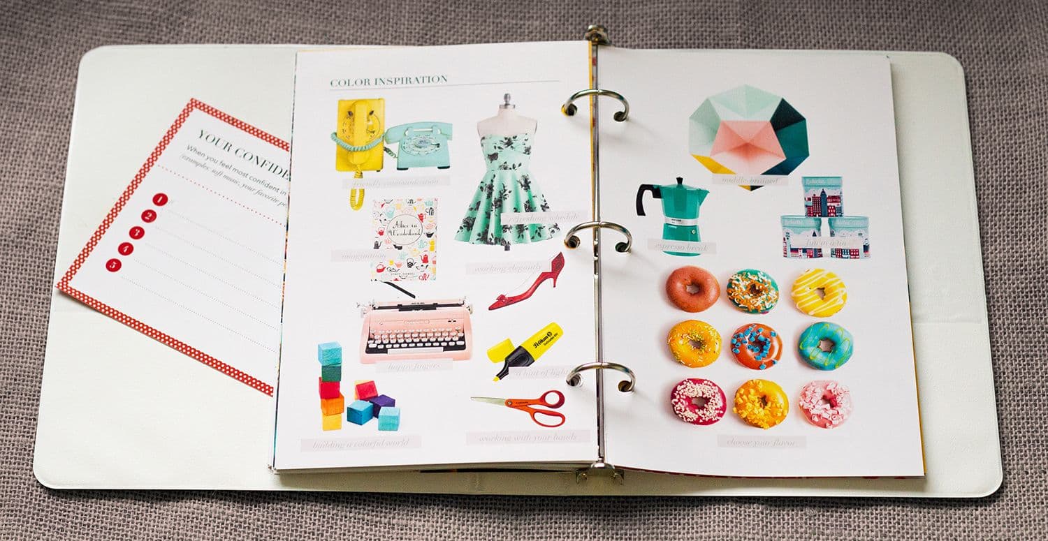
One unique element we developed was a dynamic pattern system based on geometric shapes that could shift and reconfigure. This became a visual metaphor for the transformation we facilitated: taking existing elements (a client's vision, values, offerings) and reorganizing them into clearer, more compelling expressions. The patterns appeared throughout the brand in subtle ways, creating visual interest without overwhelming the content.
The website architecture:
The website was reorganized around three key purposes: showcasing our work with better context, explaining our process in a way that built trust, and filtering for the right clients by being clear about who we were for.
The homepage didn't try to appeal to everyone. It immediately spoke to our specific audience: "We help mission-driven businesses build brands that reflect their vision and connect with the right people." If someone wasn't mission-driven or didn't value that positioning language, they'd self-select out. That was intentional.
The portfolio was improved with better organization and more descriptive context for each project. While not full case studies, each project now had clearer descriptions that helped potential clients understand the scope and type of work we did. The focus was on making our diverse capabilities visible while maintaining a clean, professional presentation.
The process documentation:
We created a detailed explanation of the ID Discovery Process, breaking down each phase and explaining what clients could expect. This transparency served multiple purposes: it educated potential clients about the value of strategic branding work, it set clear expectations about our process and timeline, and it filtered for clients who appreciated methodical, thoughtful approaches over quick turnarounds.
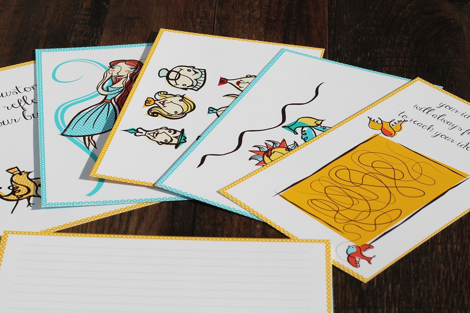
The process page included visual examples of the tools we used: discovery card sets, brand attribute mapping, competitive positioning frameworks, and design system development. Making these tools visible demonstrated the rigor of our methodology.
The internal infrastructure:
Beyond the public-facing brand, we built the operational infrastructure we'd been lacking. We documented our process step-by-step, created templated materials for each project phase (onboarding decks, discovery worksheets, presentation templates), and established systems for project management and client communication.
This infrastructure had an unexpected benefit: it forced us to clarify and standardize our methodology in ways that actually improved it. When you have to document your process, you discover the inconsistencies and gaps you'd been working around intuitively.
pattern design

pattern design

pattern design
Key Insights
Agency brands should frame client work, not compete with it.
Many creative agencies make their own brand visually loud and trend-forward, trying to demonstrate creativity through their own aesthetic. This creates a problem: the agency brand competes for attention with client work in the portfolio. Strong client projects can look diminished when presented in an overly stylized agency brand.
The restrained ShiftFWD visual identity (neutral colors, clean typography, simple layouts) was strategic. It created a professional frame that made client work the focal point. The agency brand's job wasn't to show off. It was to provide context and credibility that made the client work look even better.
Clarity about who you're NOT for is as valuable as clarity about who you ARE for.
The focused positioning (mission-driven businesses seeking brand clarity) immediately made some potential clients realize we weren't the right fit. Quick logo design projects, brand-as-decoration requests, and clients seeking trendy aesthetics over strategy would read our positioning and look elsewhere. This was excellent.
By being clear about who we were for, we filtered inquiries dramatically. We got fewer leads overall, but the quality of those leads was higher. Conversations started with aligned expectations. Clients who contacted us already understood and valued our approach. The conversion rate from inquiry to signed project increased significantly because we were only talking to people who were actually the right fit.
Process transparency builds trust more than portfolio beauty.
The detailed explanation of our ID Discovery Process on the website did more to close deals than any amount of portfolio polish. Potential clients would reference it in initial conversations: "I read through your process page and that's exactly what we need." The transparency demonstrated confidence and helped clients understand what they were buying.
Too many agencies treat process as proprietary and mysterious. But in service businesses, process is what clients are actually buying. The sooner you help them understand what working with you will be like, the faster you build trust and the better you set expectations.
Good case studies tell transformation stories, not deliverable lists.
The long-form case study format became our most powerful marketing tool. Instead of showing pretty images with minimal context, we told complete stories: here's what the client struggled with, here's how we approached the problem strategically, here's why we made specific design decisions, here's what changed for the client afterward.
These narrative case studies positioned us as strategic partners rather than vendors executing creative services. Potential clients could evaluate whether our thinking style matched what they needed. And the stories made our work memorable in a way that image galleries never do.
Building your own brand forces you to clarify what you actually believe.
Going through our own discovery process revealed beliefs and values we'd never articulated clearly. We realized we weren't just "a branding agency." We believed that branding should be rooted in authenticity, that visual identity needs strategic foundation, that the best client relationships are collaborative partnerships, and that purpose-driven businesses deserve design that honors their mission.
These beliefs became the foundation of our positioning and messaging. They weren't marketing constructions. They were genuine convictions that informed how we worked. This authenticity made the brand more coherent and our client relationships stronger.
Process
Week 1: Discovery and positioning
We started by running ourselves through the ID Discovery Process exactly as we would for a client. This meant asking uncomfortable questions and being ruthlessly honest about the answers. What do we actually offer that's different? Who have we done our best work for? What patterns exist in our most successful projects?
We analyzed every project we'd completed, identifying which clients we'd loved working with and why. This revealed that industry didn't matter. Mission-driven orientation did. The clients who valued our work most were building businesses around something they cared about deeply and wanted their brand to authentically reflect that commitment.
This insight gave us the positioning clarity we needed: ShiftFWD existed for mission-driven businesses seeking strategic brand clarity. Everything else followed from this foundation.
Week 2: Visual identity development
With positioning clear, I moved into visual identity exploration. I sketched dozens of logo concepts, from literal (arrows pointing forward) to abstract (geometric forms suggesting transformation). The direction that felt right abstracted the forward movement idea into a clean, angular mark that worked at any size.
The color palette testing was extensive. We explored bold, colorful approaches (too distracting from client work), trendy gradients (would date quickly), and eventually settled on the restrained neutral system that could adapt to any context while maintaining professional consistency.
The pattern system emerged from experimentation with the logo's geometric forms. By breaking down and reconfiguring these shapes, we created a dynamic visual language that could appear subtly throughout brand applications without overwhelming content.
Week 3: Website architecture and content
I mapped out the website architecture with a focus on three goals: filter for the right clients through clear positioning, demonstrate strategic thinking through detailed case studies, and build trust by making our process transparent.
The homepage was designed to immediately signal who we were for. No generic "We create beautiful brands" language. Instead: specific positioning that would resonate with mission-driven business owners and leave others looking elsewhere.
The portfolio structure was designed to showcase our range of capabilities (branding, web design, graphic design) while maintaining visual consistency. Each project had descriptive context that helped visitors understand what we created and for whom, making it easier for potential clients to see if our work aligned with their needs.
Week 4-5: Development and content creation
I built the website on WordPress with custom post types for portfolio projects and process pages. The CMS needed to be flexible enough for the visual showcase while remaining easy enough for us to update without developer help for every content change.
We organized our portfolio projects with better categorization and descriptions, making it easier for potential clients to find relevant examples of our work and understand our capabilities across different project types.
The process documentation required translating what we did intuitively into clear, structured explanations. This was harder than expected because we'd never fully articulated the steps of our methodology. Writing it down forced us to identify inconsistencies and refine the process itself.
Week 6: Tool and template development
Beyond the public-facing brand, we built the operational infrastructure that would make the agency more systematic. This included:
- Client onboarding deck template explaining our process, timeline, and what we'd need from them
- Discovery workshop materials including card sort exercises and brand attribute mapping frameworks
- Presentation templates for strategy and design reviews with consistent structure and branding
- Project management workflows in Asana documenting every phase of our process with checklists and milestones
Creating these templates was transformative. We'd been rebuilding materials for every project. Now we had standardized starting points that maintained quality while saving significant time.
Week 7: Brand guidelines and launch
We created brand guidelines documenting the visual system: logo usage, color applications, typography hierarchy, pattern system implementation, and photography style. These guidelines ensured consistency as we created new materials and gave us something to share with occasional collaborators.
The launch was soft. We updated the website, reached out to past clients letting them know we'd refreshed our brand and would welcome referrals, and started sharing case studies on social media. No dramatic announcement, just a quiet shift to the professional brand we should have had from the beginning.
brand storybook
brand storybook
brand storybook
brand storybook
Results
The immediate shift:
The impact was evident within weeks of launching the new brand. The quality of inquiries changed dramatically. Instead of requests for quick logo designs or vague "we need a website" projects, we received inquiries from mission-driven business owners who had read through our process documentation and explored our portfolio. They'd reference specific parts of our website in initial conversations: "Your approach to discovery is exactly what we need" or "We saw the work you did for wellness clinics and that's the direction we want."
The inquiry-to-project conversion rate nearly doubled because we were only talking to pre-qualified prospects who already understood and valued our approach. Sales conversations became collaborative discussions about fit and timing rather than convincing skeptics of the value of strategic branding.
The confidence transformation:
Perhaps the most significant result was internal: we felt proud of our brand. When speaking at conferences or networking events, we prominently displayed the ShiftFWD identity. When potential clients asked for our website, we sent it confidently knowing it represented our capabilities accurately. This pride translated into more proactive business development. We reached out to dream clients we'd previously felt weren't quite within reach.
The professional brand elevated our positioning in conversations. We were no longer two freelancers doing branding projects. We were a strategic agency with a defined methodology and proven approach. This shift in perception allowed us to command higher rates and attract more substantial projects.
The operational efficiency:
The infrastructure we'd built (templates, documented process, project management systems) made the agency significantly more efficient. Project kickoffs that previously took hours of preparation now used standardized onboarding materials. Discovery workshops followed consistent frameworks rather than being improvised each time. Presentations used templates that maintained quality while reducing design time.
This efficiency meant we could take on more projects without working longer hours or the quality suffering. We could also bring on contractors and collaborators more easily because we had documented workflows they could follow.
The portfolio effect:
The improved portfolio presentation made our work more discoverable and memorable. Potential clients would reference specific projects: "We want something like what you did for Watershed Wellness" or "We saw the branding work in your portfolio and that's the aesthetic we're looking for." The clearer organization and context helped clients understand our capabilities and articulate what they wanted from us.
The professional brand also attracted speaking opportunities and press features. Publications covering branding and design would reach out asking to feature projects or interview us about our methodology. This third-party validation further established credibility.
The client relationship quality:
The focused positioning meant we only worked with clients who were genuinely aligned with our values and approach. This made projects more enjoyable and outcomes stronger. Clients trusted our process because they'd read about it extensively before hiring us. They came prepared for discovery workshops having thought through the prompting questions we'd shared. The collaborative partnership we wanted was easier to establish because clients self-selected for that type of relationship.
We also saw more repeat business and referrals. Clients who went through the full brand strategy and design process would return for additional projects: website expansions, marketing materials, sub-brand development. And they referred others who were similar to them: mission-driven business owners seeking strategic partners.
The long-term impact:
Over the following years, ShiftFWD worked with dozens of mission-driven clients across various industries: wellness clinics, creative agencies, course creators, nonprofits, professional services. The agency developed a reputation for strategic depth and transformative brand work. Projects were featured in publications like Crazyegg, Unbounce, and Kissmetrics, establishing third-party credibility beyond our own marketing.
We were selective about projects, only taking on clients where we believed we could create meaningful impact. The standardized methodology and operational infrastructure allowed the agency to maintain quality as it grew. We brought on collaborators for development, copywriting, and specialized design work, integrating them smoothly because we had clear processes and templates they could follow.
The brand we built gave ShiftFWD the credibility platform to evolve from freelance partnership to respected boutique agency serving clients who valued strategic thinking as much as creative execution.
Explore the live portfolio and detailed case studies: shiftfwd.com/portfolio →
Learnings
You cannot skip doing your own brand work, even when (especially when) you're busy.
The rationalization that "we'll get to it when we have time" kept our agency brand mediocre for years. We always had client work that felt more urgent. But the inadequate brand was quietly costing us opportunities and credibility. Taking seven weeks to focus on our own brand, despite the short-term financial cost, transformed the trajectory of the agency.
This lesson applies beyond agencies: if you're a service provider whose credibility depends on demonstrating expertise, your own brand can't be an afterthought. It needs the same rigor and investment you'd give client work.
Treating yourself as a client reveals uncomfortable truths.
Going through our own discovery process forced us to confront questions we'd been avoiding. What do we actually believe about branding? Who do we want to work with? What transformation do we create? These weren't easy to answer honestly. We discovered assumptions we'd never examined and inconsistencies between what we preached and what we practiced.
But this discomfort led to clarity. The positioning, messaging, and methodology that emerged from treating ourselves as a client were stronger because they were rooted in genuine self-examination rather than surface-level marketing.
Focused positioning feels risky but pays off dramatically.
Narrowing our target to "mission-driven businesses seeking brand clarity" felt like we were limiting our potential market. We worried about turning away projects. But the opposite happened. The clear positioning attracted better-fit clients while filtering out poor-fit inquiries. We got fewer total leads but higher quality prospects. The conversion rate improved because conversations started with aligned expectations.
Broad positioning (serving everyone) sounds safe but makes you forgettable. Specific positioning (serving a defined audience) feels risky but makes you remarkable to the right people.
Infrastructure isn't overhead; it's leverage.
Building templates, documenting processes, and systematizing workflows felt like time that could have been spent on billable client work. But this infrastructure created leverage. Projects moved faster. Quality stayed high without requiring our constant involvement in every detail. Collaborators integrated smoothly. The time invested in systems paid back exponentially in efficiency and scalability.
Too many freelancers and small agencies resist systematization because it feels corporate or constraining. But systems don't eliminate creativity. They handle the repeatable parts so you can focus creative energy where it matters most.
Clear portfolio presentation with context matters more than visual polish alone.
Improving our portfolio with better organization and descriptive context made it significantly easier for potential clients to evaluate our work. Instead of just beautiful images, visitors could understand what we created and for whom. This context helped them self-identify whether our capabilities matched their needs.
You don't need elaborate case studies to demonstrate strategic thinking. Even short project descriptions that provide context about the challenge and approach help clients understand that you're solving problems, not just making things look pretty.
Process transparency doesn't give away your secret sauce; it builds trust.
We initially hesitated to document our ID Discovery Process in detail on the website, worried that competitors would copy our methodology or that clients wouldn't see value in paying for a process they could now read about. Neither concern materialized. Competitors didn't have the experience to implement a process just from reading about it. And clients valued the transparency because it helped them understand what they were investing in.
The detailed process documentation became a trust-building tool. Clients felt confident working with us because they knew exactly what to expect. The transparency demonstrated our confidence in the methodology.
Your brand work is never finished; it just becomes maintainable.
We didn't "complete" the ShiftFWD brand and never touch it again. We continued refining messaging, adding portfolio projects, updating process documentation, and evolving the visual system as the agency grew. But we'd built the infrastructure that made these updates straightforward rather than requiring complete rebuilds.
The goal isn't a perfect, finished brand. It's a strong foundation and systematic approach that allows the brand to evolve sustainably as the business grows.