Nova Donna: Bold, Modern Branding for a Shop That Empowers Creative Professionals
Client
Nova Donna
Completed
2020-04-14
Overview
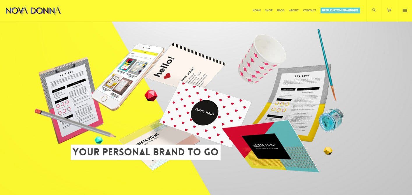
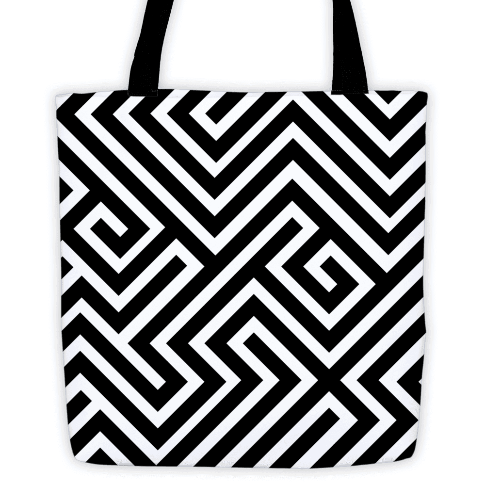
Nova Donna is a passion project I created from the ground up—a digital shop offering ready-made business card templates, resume designs, and stylish merch like branded tote bags.
Overview
I've spent years designing brands for other people. I know the process inside and out: the discovery sessions, the mood boards, the careful refinement of every detail until the identity feels inevitable. But I'd never done it for myself. Not really. Not in a way that felt like I could break all my own rules and see what happened.
Nova Donna started as a side project in 2020, during one of those creative restless phases where you need to make something just for the joy of making it. No client briefs, no revision rounds, no explaining design choices to stakeholders. Just pure creative exploration with a simple premise: what if I created a shop selling ready-made design templates and merch for creative professionals who wanted to look more put together?
The idea wasn't revolutionary. Etsy and Creative Market were already full of template shops. But most of them fell into one of two camps: either overly corporate and boring, or so Pinterest-pretty they felt more decorative than functional. I saw an opportunity for something different. Something bold, editorial, and unapologetically modern. Something that made young professionals feel like the main character in their own career story.
Nova Donna became my design playground. A place to test ideas about brand identity, ecommerce psychology, and visual storytelling without the constraints of client work. It was also a test: could I build something from nothing and make it feel premium enough that people would actually buy it?
Problem
The template market has a trust problem. When you're shopping for a business card or resume template, you're not just buying a file. You're buying confidence. You're hoping this design will make you look more professional, more credible, more like someone who has their life together. That's a lot of emotional weight for a $15 Etsy purchase.
I started by doing what I always do: research. But this time, I wasn't interviewing clients or running formal user studies. I was reading hundreds of Etsy reviews, scrolling through Creative Market comments, and joining Facebook groups for freelancers and job seekers. I wanted to understand the gap between what people were buying and what they actually needed.
What I found was fascinating:
The most common complaint wasn't about design quality or file formats. It was about feeling. People would buy a template, customize it, and still feel like it wasn't "them." The designs were either too corporate (making creative professionals feel stifled) or too decorative (making them feel less credible). There was very little middle ground.
I also noticed a pattern in the successful shops. The ones that sold consistently weren't just selling templates. They were selling a version of yourself you aspired to be. Their product photography showed the templates in aspirational contexts: on beautiful desks, held by confident hands, displayed on MacBook screens in coffee shops. They weren't selling PDFs. They were selling transformation.
The challenge became clear:
I needed to create products that felt professionally credible but personally expressive. Bold enough to stand out, but usable enough that people would actually feel confident sending them to potential employers or clients. And I needed to build a brand that made the entire experience feel like an upgrade, not just another template purchase.
The other challenge was more personal: I was designing for myself as much as for customers. I'm the kind of person who wants clean lines and editorial sophistication, but also color and personality. I couldn't stand the idea of building something safe and forgettable. Nova Donna had to feel like me, even if "me" wasn't the obvious choice for mass market appeal.
Solution
The name came first. "Nova Donna" translates roughly to "new woman" in Italian, though it's more about the sound and feeling than literal translation. I wanted something that felt modern and feminine without being delicate. Something that sounded like a fashion brand or a creative studio, not a craft store. The name had to carry weight.
The brand identity:
I broke my own rules immediately. Most of my client work leans toward restraint: neutral palettes, classic typography, timeless choices that age well. Nova Donna was the opposite. I chose a bold, high-contrast palette anchored by deep charcoal and crisp white, then added unexpected pops of peach, rose, and warm terracotta. These weren't the millennial pink and sage green that dominated Instagram in 2020. They were editorial colors. Fashion magazine colors. The kind of palette that felt sophisticated but still energetic.
The logo is a custom sans-serif wordmark, all caps, with generous letter spacing. It's confident without being aggressive. I paired it with a secondary mark: a stylized "N" monogram that could work on product tags, social graphics, and packaging. The whole system feels like it belongs on a magazine cover, not an Etsy shop.
Typography was crucial. I chose a geometric sans-serif for headlines (bold, structural, modern) and a more humanist sans-serif for body copy (still clean, but warmer and more approachable). This combination reinforced the brand positioning: professional credibility with personal warmth.
The product design approach:
Every template I designed for Nova Donna followed the same principle: make it easy to customize but hard to ruin. I built in constraints that would guide users toward good design choices even if they didn't have design training.
For business cards, I created modular layouts where you could swap in your own details but the structure and hierarchy remained intact. For resumes, I designed systems where the typography and spacing would automatically adjust when you added or removed sections. The templates had personality, but they were also foolproof.
I tested this approach on friends who weren't designers. I watched them customize the templates and noted where they got stuck or made choices that broke the design. Then I adjusted the templates to make those mistakes impossible. If someone consistently changed the heading color to something that clashed, I'd remove that option or provide a curated color palette built into the file.
The ecommerce experience:
The Nova Donna shop had to feel less like browsing an online marketplace and more like shopping in a boutique. I designed the product pages with large, editorial-style photography that showed the templates in context. Not just flat screenshots, but staged scenes: business cards on marble surfaces, resumes on desks with coffee cups and plants, tote bags carried by hands with perfectly manicured nails.
I wrote product descriptions that focused on transformation, not features. Instead of "includes 3 color variations," I'd write "choose the version that matches your energy: bold coral for the creative entrepreneur, sophisticated charcoal for the corporate climber, or soft blush for the feminine professional." I was selling feeling, not files.
The entire shopping experience was designed around one core insight from my research: people want to feel like they're making a smart, stylish choice. So I removed friction, added social proof through styled photography, and made the checkout process as elegant as the products themselves.
website design
website design
website design
Key Insights
The first product launch was terrifying.
I spent weeks designing the initial collection: three business card templates, two resume designs, and a tote bag design. I photographed everything myself, wrote all the copy, set up the Etsy shop, and finally hit publish on a Saturday morning. Then I immediately questioned everything. Was the pricing too high? Were the colors too bold? Would anyone actually buy these?
The first sale came within three hours. A graphic designer in Portland bought the "Bold Coral" business card template. She left a review two days later: "This is exactly what I was looking for. Professional but not boring. Finally a template that feels like me."
That review crystallized something I'd suspected but hadn't fully articulated: people weren't buying templates. They were buying permission to be themselves professionally. The Nova Donna brand gave them that permission. It said, "You can be bold and credible. You can be feminine and taken seriously. You can have personality and professionalism."
The unexpected insight about constraints:
The templates that sold best weren't the ones with the most customization options. They were the ones with the most constraints. The business cards where you could only change your name, title, and contact info (but not the layout, colors, or typography) outsold the "fully customizable" versions by a significant margin.
This taught me something valuable about design for non-designers: too much freedom is paralyzing. People want good taste built in. They want to make it "theirs" without having to make a hundred micro-decisions about kerning and color theory. The sweet spot is providing just enough customization to feel personal, but not so much that you can ruin the design.
The brand photography was doing heavy lifting:
I A/B tested product listings with different types of images. Flat, technical screenshots of the templates performed okay. But the styled photography, the ones showing the templates in beautiful contexts, completely changed the conversion rate. When people could see themselves using the product, imagine it on their own desk or in their own hands, they bought.
This wasn't just about pretty pictures. It was about storytelling. Every image needed to answer the question: "Who will I become if I use this?" The photography showed confident professionals, beautiful workspaces, and aspirational scenarios. It sold transformation, not templates.
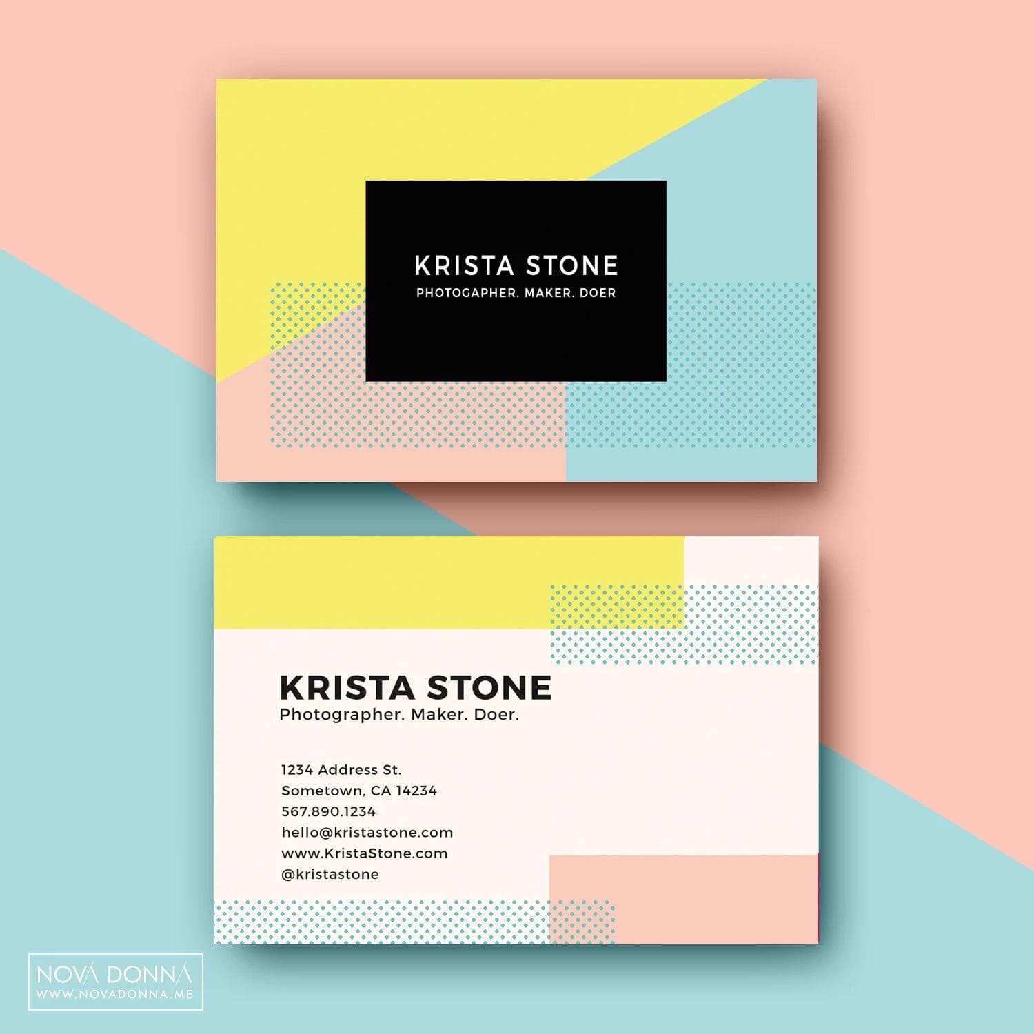
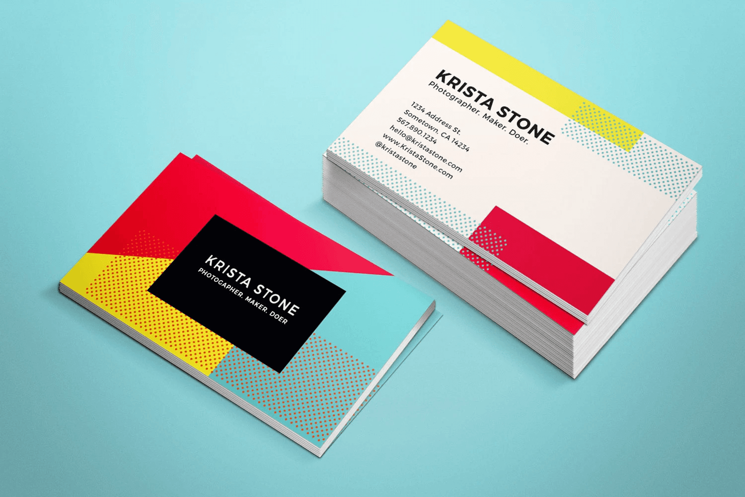
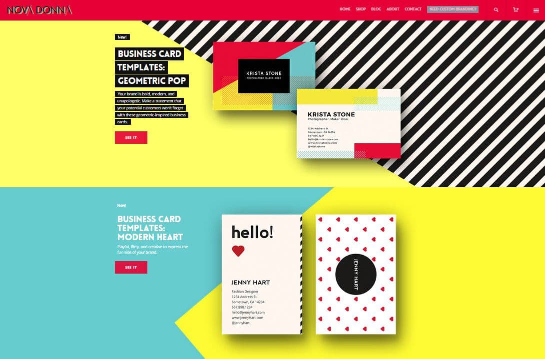
business card design
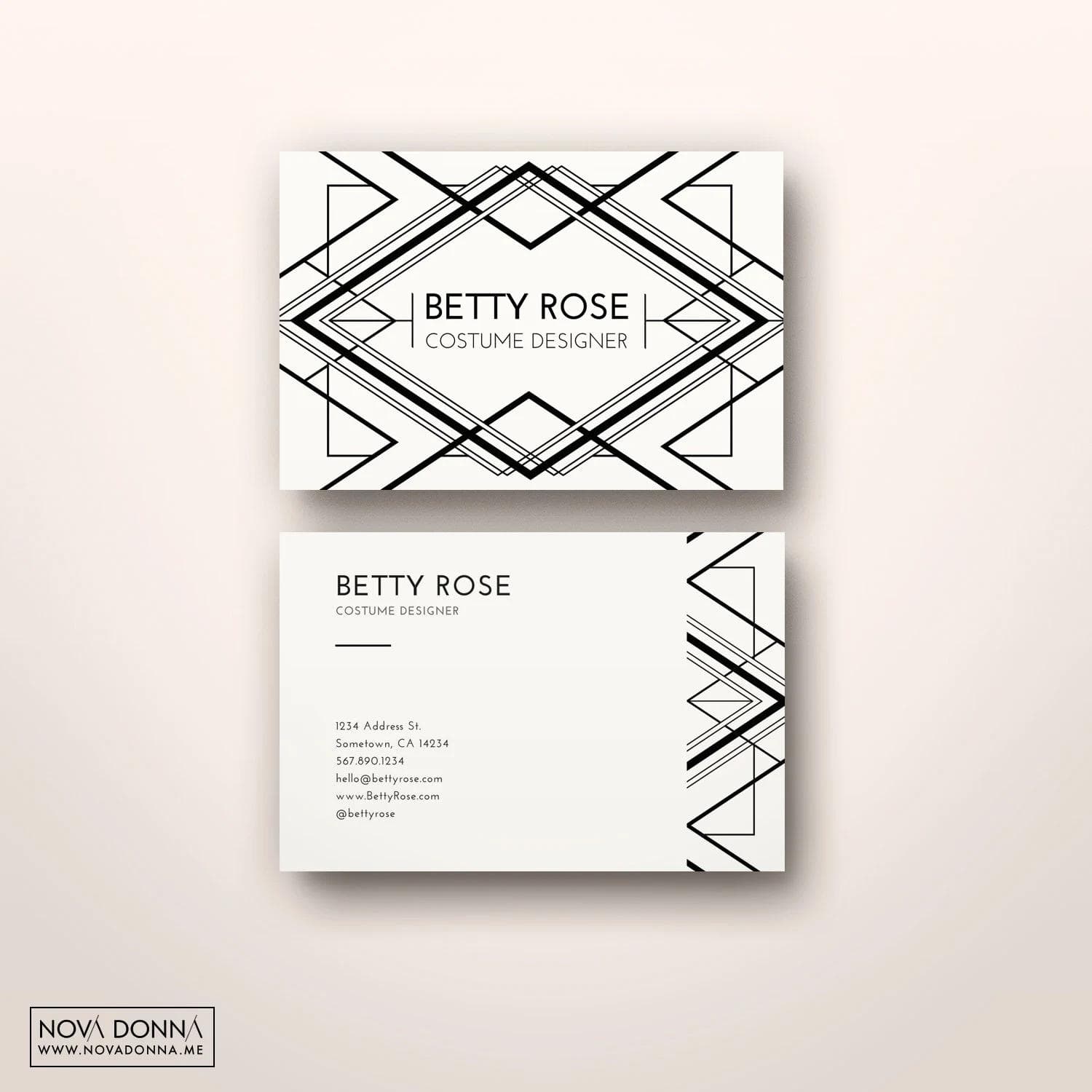
business card design
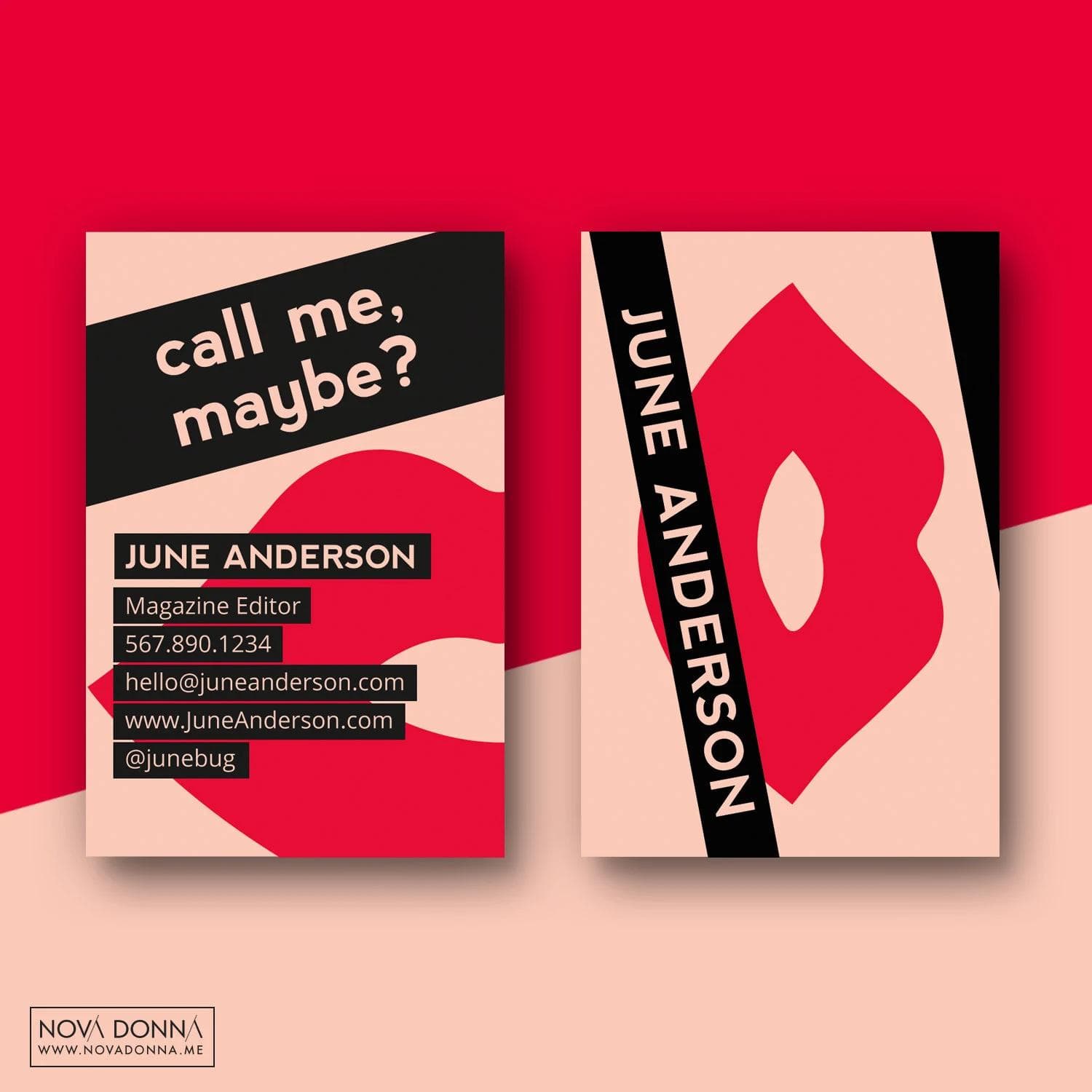
business card design
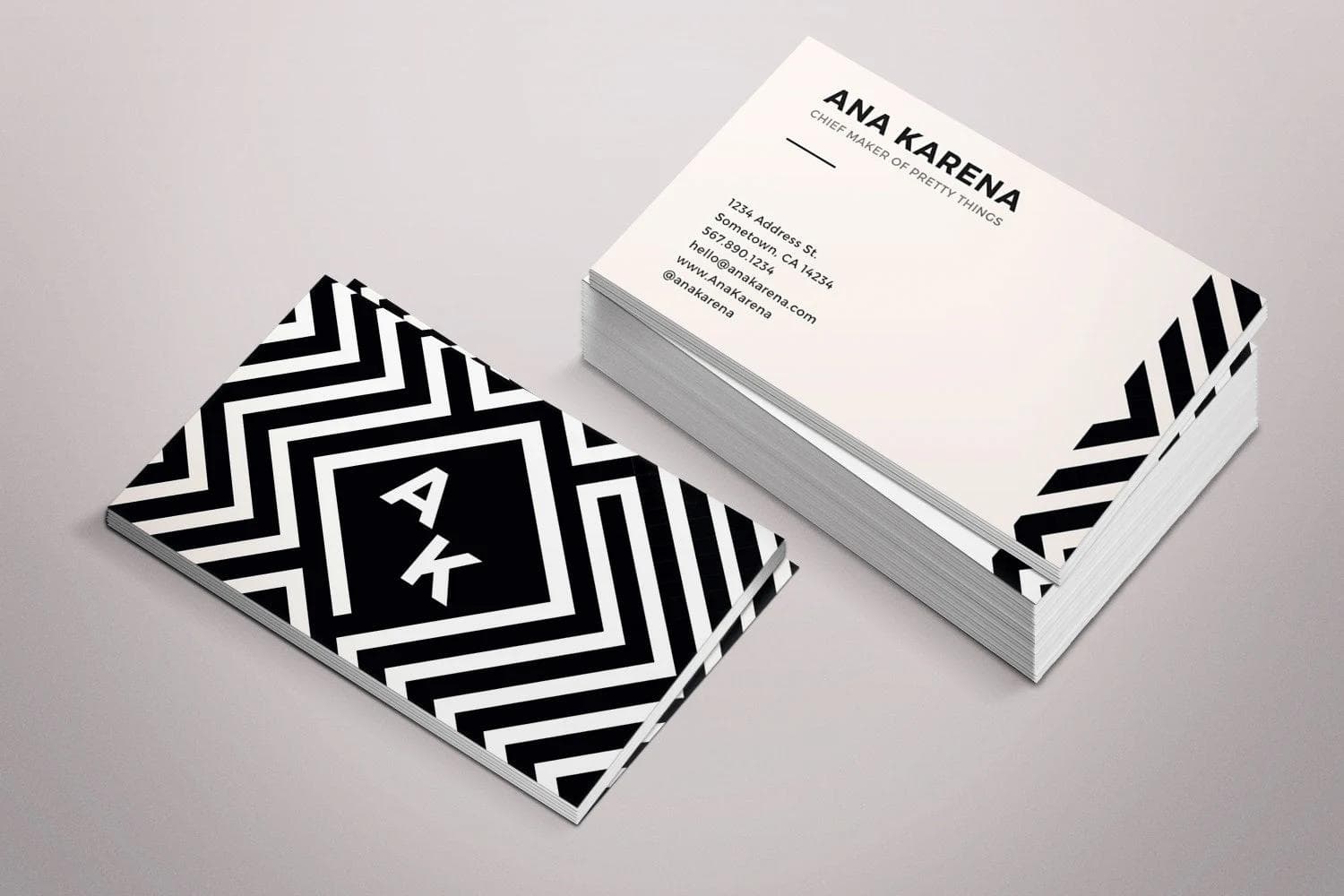
business card design
Process
Working on your own brand is both freeing and paralyzing. There's no one to approve your ideas, which means you can try anything. But there's also no one to tell you when to stop iterating. I had to be both designer and client, which required discipline I didn't know I needed.
Phase 1: Brand foundation and visual exploration
I started the way I start all projects: with a mood board. But this time, I gave myself permission to pull from sources I'd never use for client work. I collected images from fashion editorials, Bauhaus design, vintage Italian advertisements, and contemporary art books. I wasn't looking for a specific aesthetic. I was looking for a feeling: confident, modern, unapologetically feminine, a little bit editorial, a little bit rebellious.
The color palette emerged from this exploration. I kept coming back to images with warm terracotta, soft peach, and deep charcoal. These colors felt sophisticated but approachable, bold but not aggressive. They reminded me of fashion magazines and art galleries, not craft fairs and template marketplaces.
I sketched dozens of logo concepts. Most were too literal (incorporating sewing needles or paper icons) or too abstract (geometric shapes that meant nothing). The breakthrough came when I stopped trying to symbolize anything and just focused on the wordmark itself. The final logo is pure typography: custom letterforms, generous spacing, all caps. It doesn't need to explain what Nova Donna does. It just needs to look and feel right.
Phase 2: Product design and testing
With the brand identity locked, I moved into product design. I started with business cards because they're the simplest product to test. I designed five different layouts, each with a distinct personality: minimalist and modern, bold and geometric, soft and editorial, classic and refined, creative and asymmetric.
I printed physical samples of all five designs using my own information, then carried them around for a week. I handed them out to friends, colleagues, baristas, anyone who'd take one. Then I asked for honest feedback. Which one felt most professional? Which one would make you want to work with this person? Which one felt too bold? Too boring?
The feedback was consistent: the geometric, bold designs got the most positive reactions. People described them as "confident," "modern," and "trustworthy but not corporate." The softer, more decorative designs were called "pretty" but not "professional." This confirmed my instinct: Nova Donna customers wanted to be taken seriously, which meant the designs needed to feel credible first, decorative second.
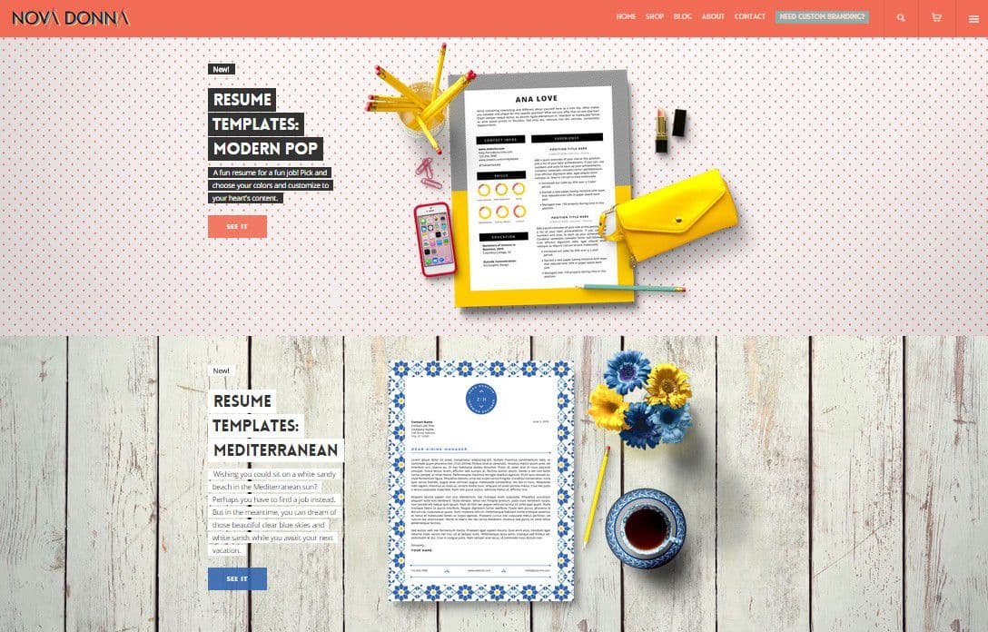
I applied these learnings to the resume templates. I built modular systems where users could easily add or remove sections (work experience, education, skills) without breaking the design. I tested them by asking non-designer friends to customize them and watching where they struggled. Every pain point became a design constraint.
Phase 3: Photography and brand storytelling
The product photography phase was the most time-consuming and the most crucial. I didn't have a budget for a professional photographer, so I learned to shoot everything myself. I bought foam boards for bounce lighting, borrowed plants and props from friends, and spent entire weekends staging product shots in my apartment.
The key was context. I didn't just photograph the templates flat. I created scenes: a business card next to a latte on a marble table. A resume on a desk with a fountain pen and a leather notebook. A tote bag on someone's shoulder with just enough visible to see the Nova Donna branding. Every photo needed to tell a micro-story about the kind of person who would use this product.
I also learned to edit ruthlessly. My first round of product photos included too many props, too much styling. They looked busy. I simplified: cleaner backgrounds, fewer elements, more negative space. The final images felt editorial because they had room to breathe.
Phase 4: Ecommerce setup and launch optimization
Setting up the Etsy shop was technically straightforward but strategically complex. I had to make decisions about pricing (high enough to feel premium, low enough to convert impulse buyers), product descriptions (aspirational but informative), and shop policies (friendly but professional).
The navigation structure took several iterations. My first version had too many categories: "Business Cards," "Resumes," "Social Media Templates," "Physical Products." Testing revealed that people browsed by feeling, not by product type. So I reorganized around use cases: "For the Creative Entrepreneur," "For the Job Seeker," "For the Side Hustler." This shift increased time on site and reduced bounce rate.
I also added strategic friction in places most ecommerce advice tells you to remove it. Instead of making all products immediately purchasable, I added "How to Use" sections that explained what software you'd need and what was customizable. This increased trust and reduced support questions about file compatibility.
The launch:
I soft-launched Nova Donna to my email list first (about 500 people, mostly other designers and creative professionals). The response was encouraging but not overwhelming. A few sales, positive feedback, some social shares. I learned from those early customers what messaging resonated and what caused confusion.
Two weeks later, I did the public launch on Etsy with refined product descriptions, better photography, and clearer positioning. That's when things started moving. The combination of strong branding, clear value proposition, and strategic SEO (I'd researched exactly what terms people searched for when looking for templates) started bringing organic traffic.
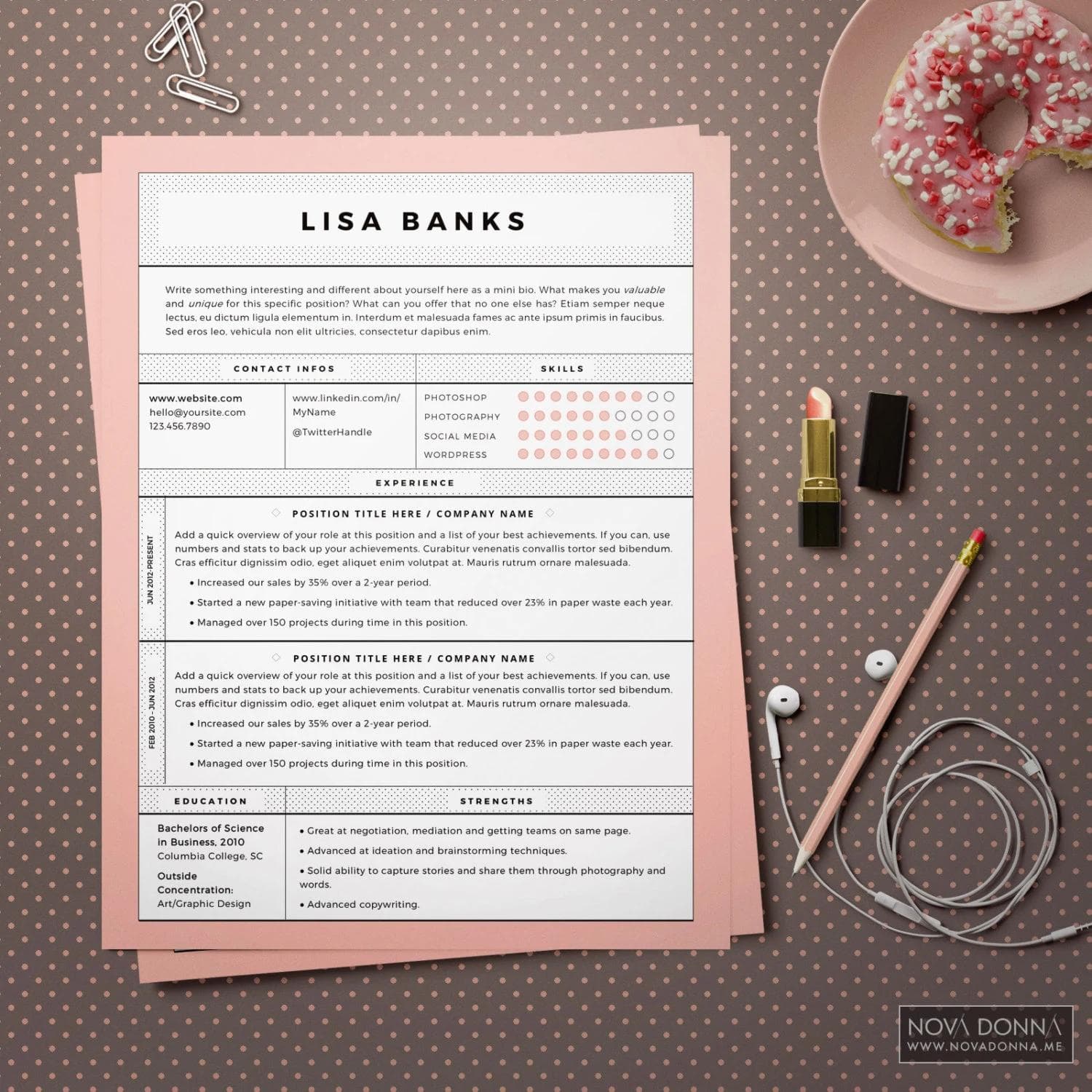
resume template design
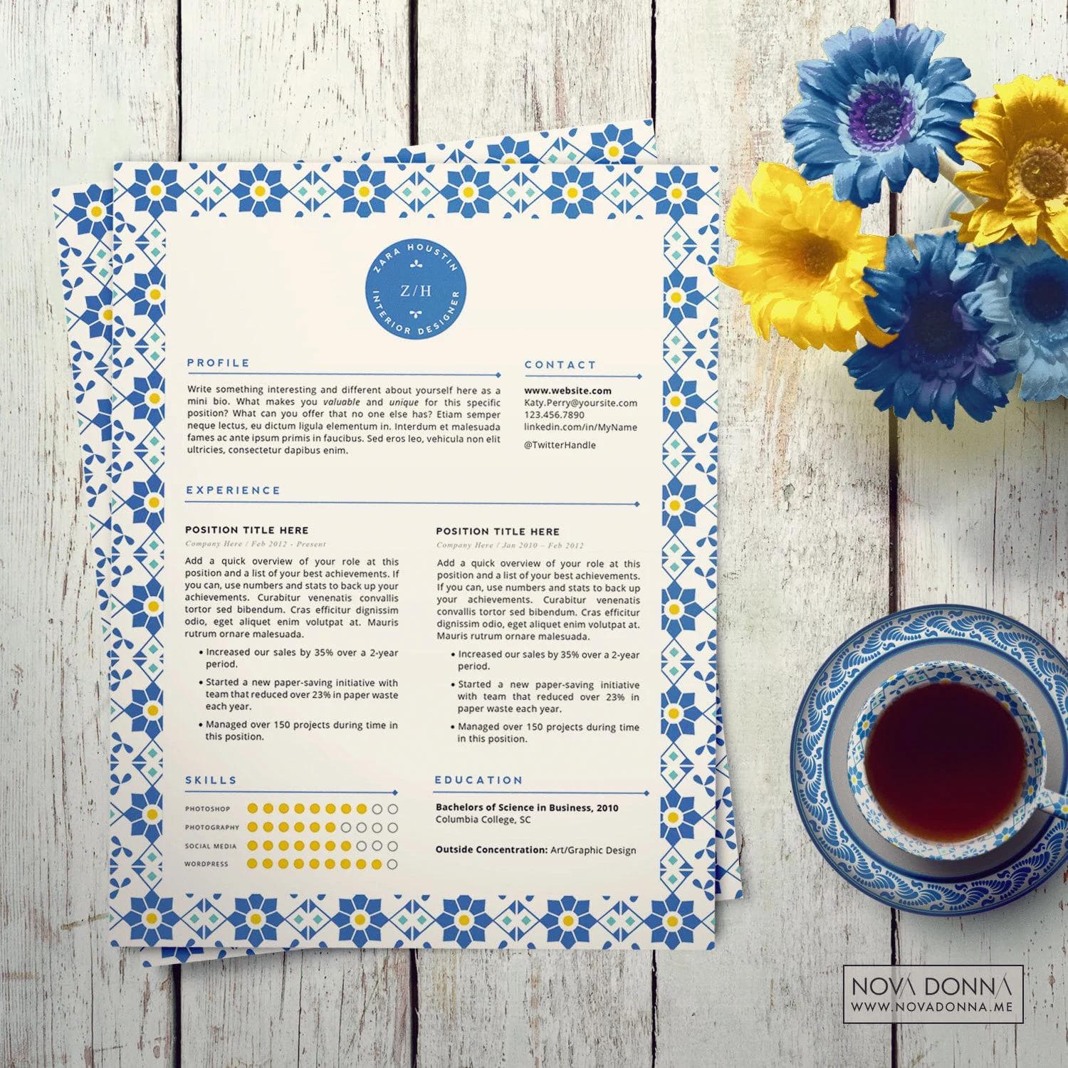
resume template design
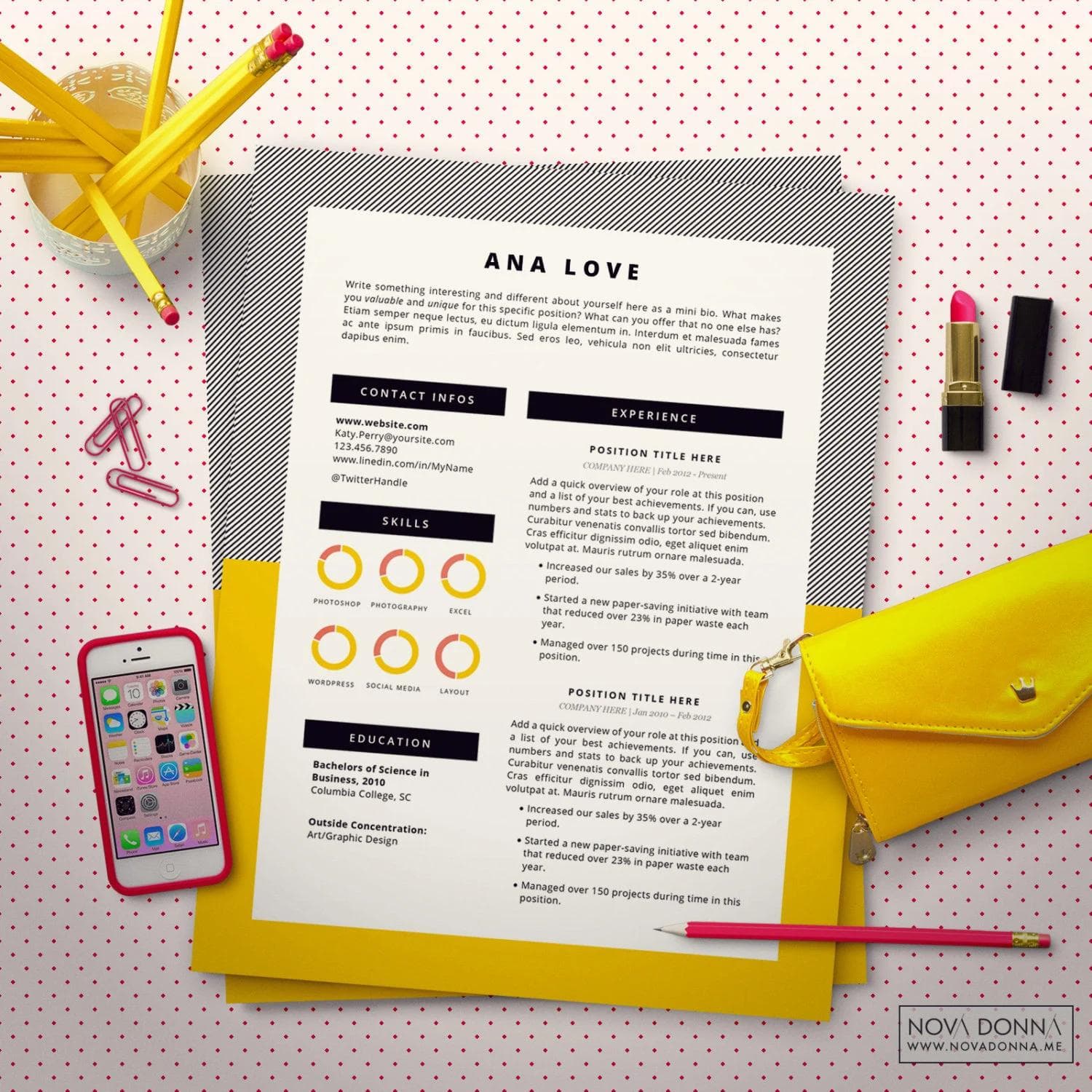
resume template design
Results
The numbers told one story. Within the first month, Nova Donna generated over 100 sales across different products. The business card templates were the bestsellers (accounting for about 60% of revenue), followed by resume templates and tote bags. The average order value was higher than I'd projected, suggesting that the premium positioning was working.
But the reviews told a better story. People weren't just buying files. They were buying confidence. One customer wrote: "I've been using the same boring resume template for years. This one made me feel like I could actually compete for the jobs I want." Another said: "I finally have business cards that feel like me. Professional but not stuffy."
What actually happened:
The initial product line sold out within the first two weeks. Not because I had limited inventory (these are digital products), but because I intentionally created scarcity by offering "launch editions" with bonus elements. This created urgency and validated that the pricing was right.
I learned quickly which products resonated and which didn't. The highly constrained templates (where you could only change text, not design) outsold the flexible ones by a significant margin. The tote bags became an unexpected hit, with customers buying them as gifts or treating themselves after landing a new job or client. The social media templates I thought would be popular barely sold at all.
The brand's impact beyond sales:
Nova Donna started getting featured in design roundups and template collections on sites like Creative Market and design blogs. Other designers reached out asking if I'd be interested in white-label partnerships (I wasn't, but it validated the brand's strength). The Instagram account grew organically because the branded product photography was so shareable.
More importantly, Nova Donna became a case study I could point to in client conversations. When clients were nervous about bold design choices, I could show them Nova Donna and say: "This is what happens when you lean into personality instead of playing it safe." It gave me credibility in ecommerce design, brand photography, and product positioning, areas I hadn't formally worked in before.
The expansion:
Based on sales data and customer requests, I expanded the product line. I added more resume variations, created matching cover letter templates, and designed a "New Job Kit" bundle that included everything someone would need for a job search. The tote bag line expanded to include different colorways and patterns.
I also added a lower-priced product tier: individual social media templates at a $5 price point. These didn't sell as well as I hoped, but they served a different purpose. They were gateway products that introduced people to the Nova Donna brand, many of whom came back later to buy the higher-priced resume or business card templates.
Learnings
Nova Donna taught me lessons I couldn't have learned from client work alone. When you're designing for someone else, you can blame external constraints when things don't work. But when you're the designer, the product creator, the marketer, and the business owner, every decision is yours. Every success and every failure teaches you something direct and personal.
The biggest lesson: Constraints create better products.
I started by trying to give customers maximum flexibility. Want to change the colors? Go ahead. Want to adjust the typography? Sure. Want to rearrange the entire layout? Why not. This approach flopped. Customers didn't want infinite options. They wanted good taste built in and just enough customization to make it feel personal.
When I redesigned the templates with tight constraints (you can only change the text and choose from three pre-set color palettes), sales increased and support questions decreased dramatically. People weren't overwhelmed by choices. They could customize quickly and feel confident the result would still look good. This completely changed how I approach design systems in client work. Sometimes the best user experience means removing options, not adding them.
The second lesson: Premium is a feeling, not a price.
Nova Donna's templates were priced higher than most competitors. I worried this would hurt sales. Instead, it helped. The higher price signaled quality and made people value the purchase more. But price alone wasn't enough. The entire experience had to feel premium: the photography, the product descriptions, the packaging (even for digital products, I designed a custom "unboxing" PDF that came with each download), the follow-up emails.
One customer told me she bought a Nova Donna template over a cheaper alternative because "it felt like I was investing in myself, not just buying a file." That's the difference between competing on price and competing on value. Price is a race to the bottom. Value is a story you tell through every touchpoint.
The third lesson: Your brand attracts or repels the right people.
Nova Donna's bold, feminine aesthetic was polarizing. Some people loved it immediately. Others said it was "too much" or "not for me." I used to think this was a problem. Now I see it as a feature. A strong brand doesn't appeal to everyone. It appeals intensely to the right people and politely repels everyone else.
The customers who bought from Nova Donna became evangelists. They tagged the brand on Instagram, left detailed reviews, and recommended it to friends. This only happened because the brand had a clear point of view. If I'd made it more generic to appeal to a wider audience, it would have resonated with no one.
What I'd do differently:
I would have started building an email list earlier. I launched Nova Donna with no email marketing strategy, relying entirely on Etsy's platform and organic social media. While this worked initially, it meant I didn't own the customer relationship. Etsy could change their algorithm tomorrow and tank my traffic. If I'd built an email list from day one, I would have had a direct line to customers independent of any platform.
I also would have tested pricing more aggressively. I started conservative and raised prices incrementally as the brand proved itself. In retrospect, I should have started at the premium tier. The customers who bought at $15 would have bought at $25. I left money on the table by undervaluing the emotional transformation the products provided.
What surprised me:
The business cards sold far better than I anticipated, but not always in the way I expected. Yes, people bought them as traditional business cards for networking and professional use. But a significant number of customers bought them as calling cards, a more personal way to share contact information when meeting new people socially. They'd hand them out at events, parties, or casual meetups as a stylish alternative to awkwardly typing numbers into phones.
This taught me to pay attention to how people actually use your products, not just how you intended them to be used. Sometimes customers find value you didn't plan for. The key is noticing what's working and leaning into it, even if it wasn't part of the original plan.
The lasting impact:
Nova Donna ran for about two years before I scaled it back to focus on other projects. But its influence on my work continues. The lessons about constraints, premium positioning, brand photography, and emotional storytelling show up in every client project I touch. It gave me confidence to push clients toward bolder choices and defend strong creative decisions with evidence, not just intuition.
More than that, it proved I could build something from nothing. No client brief, no stakeholder approval, no safety net. Just an idea, some design skills, and the willingness to put it out into the world and see what happened. That confidence is worth more than the revenue Nova Donna generated.
This project taught me that the best way to learn is to have skin in the game. You can study design theory and read case studies all day, but nothing teaches you like putting your own work out there and watching real people decide whether to buy it or not. Every sale was validation. Every bounce was a lesson. And every customer review taught me something about what people actually value when they make a purchase.
Nova Donna was never meant to be a massive business. It was a creative experiment that became a profitable side project that became a portfolio piece that became a source of professional lessons I carry into every project now. That evolution, from personal project to professional asset, is the real success story.