Fashion Communicators International: Flexible and Modern Branding

Client
Fashion Communicators International
Completed
2019-11-21
Overview
Fashion Communicators International (FCI) was a global organization focused on elevating the field of fashion communication through an inclusive, international lens. They sought a bold, cohesive brand identity that could unify their message while allowing for creative and cultural expression across regions.
Overview
When Fashion Communicators International (FCI) reached out in 2019, they were ready to level up. FCI was founded to elevate fashion communication as a legitimate academic and professional discipline, bringing together educators, researchers, and industry professionals from around the world. They had an existing brand identity that had served them well in their earlier stages, but as the organization matured and their ambitions grew, they wanted a visual identity that matched the level they were aiming for.
The organization had grown organically, starting as informal gatherings at fashion conferences and evolving into a structured international network. Along the way, different chapters and regional groups had created their own materials, their own interpretations of the logo, and their own approaches to visual identity. This organic growth had gotten them to where they were, but they were ready for a more cohesive, strategic approach to their brand that could support their next phase of growth and credibility in the fashion communication field.
But here's what made this project interesting: FCI didn't want a rigid corporate brand that would flatten the diversity and personality of their international network. Fashion communication is inherently creative, expressive, and culturally specific. The brand needed to unify without homogenizing. It needed to establish credibility without losing personality. And it needed to work across dramatically different cultural contexts, from European design schools to American universities to emerging fashion markets in Asia and Africa.
The challenge wasn't just designing a logo. It was creating a flexible brand system that could maintain visual cohesion while allowing for creative interpretation. A system that said "we're a professional organization" but also "we celebrate the diversity and creativity of fashion communication." Most brand systems are built for consistency and control. This one needed to be built for consistency and expression.
Problem
The first conversation with the FCI leadership team revealed the core tension immediately. The organization included academics who wanted credibility and professionalism, industry professionals who wanted contemporary relevance, and creative practitioners who wanted visual freedom. Every stakeholder had different priorities, different aesthetic preferences, and different ideas about what the brand should communicate.
The specific challenges:
The existing brand materials were inconsistent across regions and applications. Different chapters were using different versions of the logo, different color schemes, different typography. There was no cohesive visual language connecting these materials. If you saw three different FCI presentations at a conference, you might not realize they were from the same organization. The organization was ready to move from this organic, decentralized approach to a more unified, strategic system.
The strategic challenge was that fashion communication as a field sits at the intersection of academia, industry, and creativity. It's scholarly but also practical. It's rooted in research but also about aesthetics and cultural trends. FCI needed a brand that could operate in all these contexts without feeling out of place in any of them. Too academic and they'd alienate industry partners. Too trendy and they'd undermine their scholarly credibility. Too corporate and they'd lose the creative energy that makes fashion communication interesting.
The multicultural complexity:
FCI's membership spanned dozens of countries, each with different design aesthetics and cultural associations with color, typography, and imagery. What feels professional and trustworthy in Europe might feel cold and impersonal in Latin America. What looks contemporary and fresh in North America might feel too casual in Asia. The brand system needed to work across these cultural contexts without requiring different versions for different regions.
This is harder than it sounds. Most global brand systems handle cultural differences by creating region-specific variations, essentially designing multiple brands. But FCI wanted one cohesive system that could flex to accommodate cultural interpretation while maintaining recognizable consistency.
The practical constraints:
The organization had limited budget and no dedicated design team. Most materials would be created by regional coordinators using basic design tools, not professional designers. The brand system needed to be simple enough for non-designers to implement correctly while still being sophisticated enough to communicate the organization's credibility and vision.
This meant the system couldn't rely on complex layouts, intricate design elements, or precise execution. It needed to work even when applied imperfectly. The logo needed to be clear and recognizable at any size. The color palette needed to be distinctive but not so specific that slight variations would break the visual consistency. The typography needed to be accessible (meaning free or widely available) while still having personality.
The underlying question:
How do you design a brand system that unifies without constraining? That establishes clear visual identity while allowing for creative interpretation? That works across cultures without requiring localization? Most brand guidelines are about control: "always do this, never do that." This project needed guidelines that enabled rather than restricted.
color palette study
logo placement examples
Solution
The answer came from studying fashion itself. Fashion is a discipline built on constraints that enable creativity. A collection works because it has a cohesive point of view, but within that framework, individual pieces express variation and personality. The FCI brand needed to work the same way: strong foundational elements that created recognizable consistency, with flexibility in how those elements could be combined and expressed.
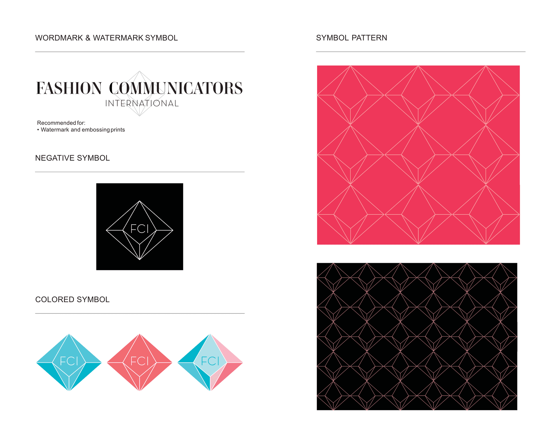
The logo system:
The logo became the anchor. I designed a clean, modern wordmark that felt editorial rather than corporate. The letterforms were geometric and precise, giving it academic credibility, but with subtle personality in the curves and spacing that kept it from feeling cold. It worked equally well at small sizes on business cards or large on conference banners.
But here's the key decision: I created a flexible logo system, not just a single logo. There was a primary horizontal version, a stacked vertical version, and a simplified monogram for small applications. This gave regional coordinators options depending on their layout needs without fragmenting the visual identity. Whether someone saw the full wordmark or just the monogram, they'd recognize it as FCI.
The logo was designed to work in multiple color applications: full color, single color, reversed on dark backgrounds, over photography. This flexibility was essential because regional chapters would be applying it in contexts I couldn't predict. The more robust and adaptable the logo, the more likely it would be used correctly.
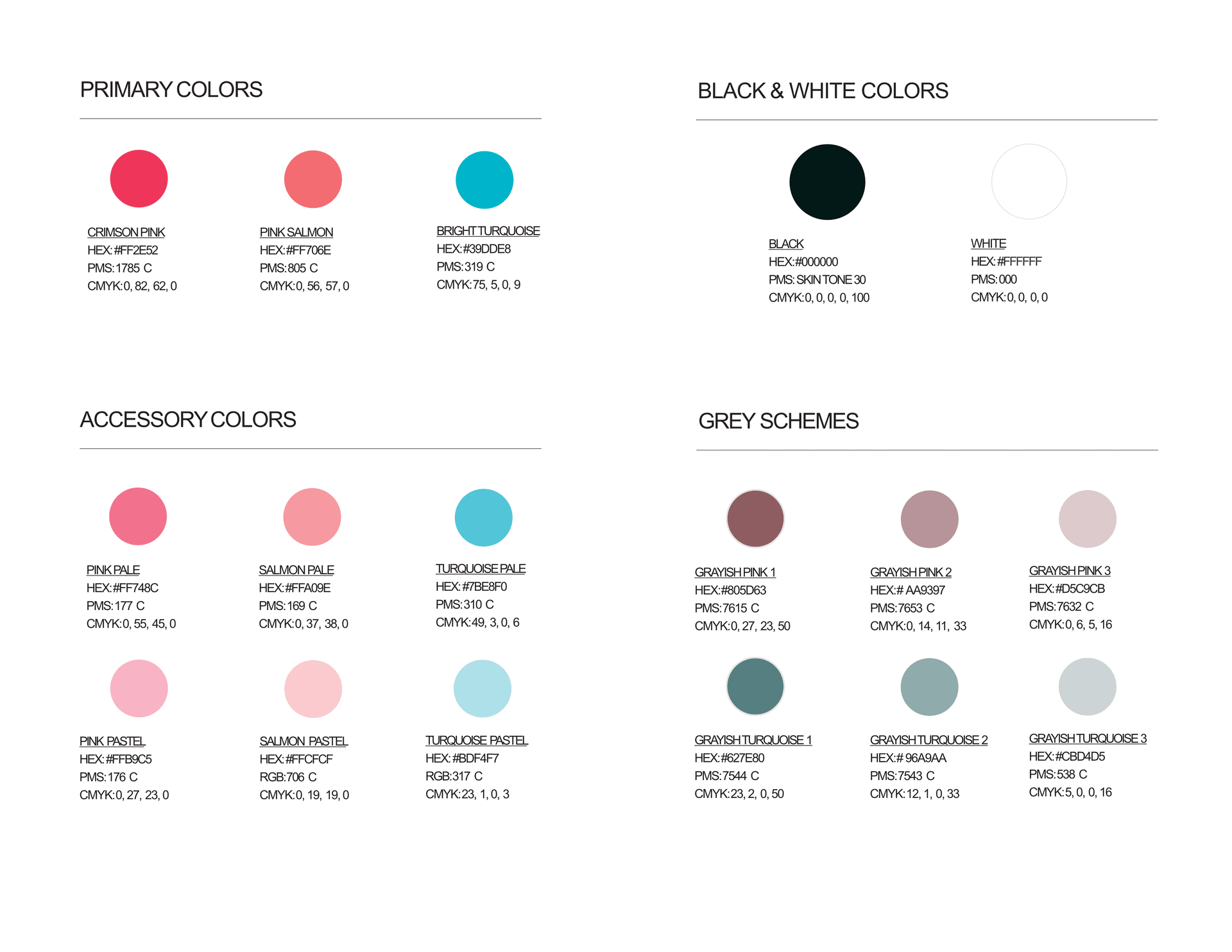
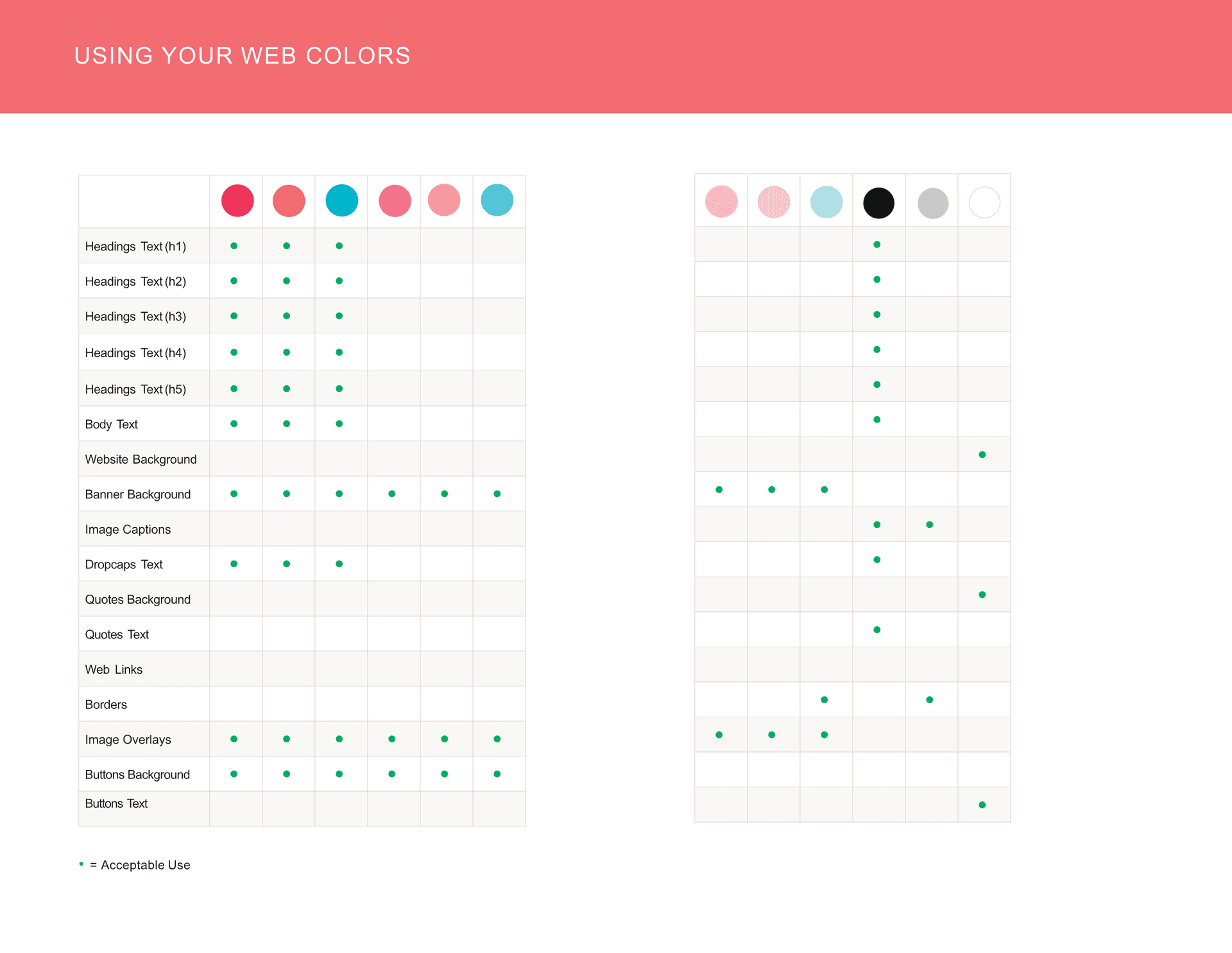
The color system:
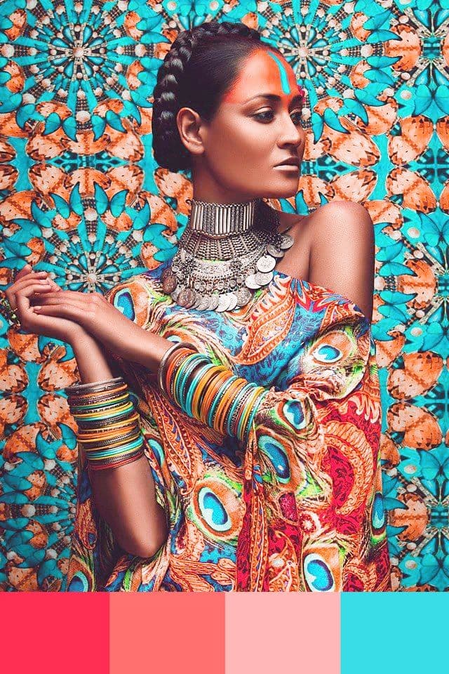
This is where the strategy of enabling creativity became most visible. Instead of prescribing one or two brand colors (which would feel restrictive and wouldn't work across cultural contexts), I created a multicultural color palette inspired by global textile traditions. Rich peacock teals, vibrant oranges, soft corals, deep burgundies, and warm golds.
The palette was deliberately diverse and expressive, reflecting the international nature of the organization. But the key was how it was structured. I designated certain colors as primary (the teals and deep tones that provided visual weight and credibility) and others as accent colors (the brighter, more expressive tones that added energy and personality). The guidelines explained that materials should be anchored in the primary palette but could use any combination of accent colors based on context, cultural preferences, or creative vision.
This gave regional coordinators creative freedom while maintaining visual consistency. A presentation in Tokyo might emphasize cooler tones with teal and coral, while an event in Mexico City might use warmer combinations with orange and gold. Both would be recognizably FCI because they used colors from the established palette, but they could express cultural personality through which colors they emphasized.
The typography:
The typography system balanced accessibility with sophistication. I chose two typeface families: a clean, editorial sans-serif for headlines and a readable serif for body text. Both were available through Google Fonts, meaning regional coordinators anywhere in the world could access them for free without licensing issues.
The sans-serif was geometric and modern, aligning with the logo's aesthetic. The serif was traditional but not stuffy, giving materials a scholarly gravitas without feeling academic in a boring way. Together, they created a visual language that worked for everything from research papers to Instagram posts.
The typography guidelines were structured to enable, not restrict. Instead of specifying exact sizes and weights for every application, I provided principles: headlines should be bold and confident, body text should be readable and spacious, pull quotes can be expressive and large. This gave coordinators a framework to work within while adapting to their specific needs.
The photography and imagery guidelines:
This was perhaps the most important part of the system for maintaining personality across cultures. Fashion communication is inherently visual, so photography needed to be expressive and creative, not generic stock imagery. But I couldn't art-direct every photo shoot happening in dozens of countries.
The solution was to provide visual principles rather than specific directives. Photography should celebrate diversity, show people engaging with fashion in authentic ways, and include texture and pattern that reference global textile traditions. Images should feel editorial rather than commercial, candid rather than overly staged.
I created mood boards showing the type of imagery that aligned with the brand: close-ups of fabric textures, diverse people in creative settings, behind-the-scenes moments of fashion education and communication. Not as exact templates, but as inspiration that communicated the visual tone and energy we wanted.
The flexible layouts:
The final piece was providing layout templates that worked in basic design tools like Canva or PowerPoint. I designed templates for presentations, social media posts, event materials, and conference posters. Each template used the established color palette, typography, and logo system, but with different layouts and compositions.
The templates were structured to be modular. Someone could swap out images, change color combinations, adjust text lengths, and the design would still work. This was crucial because most materials would be created by people with minimal design skills. The templates needed to be foolproof while still allowing for personalization and creativity.
color guidelines
web color guidelines
Process
Phase 1: Discovery and stakeholder alignment (Week 1-3)
The first challenge was getting alignment from a diverse leadership team with different priorities and aesthetic preferences. I facilitated a series of workshops where we defined FCI's mission, values, and positioning. Instead of asking "what should the brand look like," I focused on strategic questions: "What do you want people to feel when they encounter FCI?" "What makes your organization different from other fashion communication groups?" "What behaviors do you want the brand to enable?"
This shifted the conversation from subjective aesthetic preferences to objective strategic goals. Once we agreed on those foundations (the brand should feel credible but creative, international but cohesive, professional but expressive), the visual decisions became easier because we had criteria to evaluate them against.
Phase 2: Visual exploration and system architecture (Week 4-6)
With strategy aligned, I moved into visual exploration. I created three distinct brand directions: one that leaned academic and conservative, one that was bold and fashion-forward, and one that balanced both. Each direction included logo concepts, color palette proposals, typography systems, and sample applications.
The leadership team gravitated toward the balanced approach, which allowed me to refine that direction with confidence. I designed the final logo system with all its variations, finalized the multicultural color palette, and established the typography hierarchy. But I also started thinking about system architecture: not just what the brand looked like, but how it would be used.
I interviewed regional coordinators to understand their actual workflow: what tools they used, what materials they created most frequently, what challenges they faced. This research shaped the entire system design. It's why I chose Google Fonts instead of premium licensed fonts. It's why I designed templates for PowerPoint and Canva instead of just providing InDesign files. The system was designed for real-world implementation, not ideal conditions.
Phase 3: Guidelines and template development (Week 7-9)
Instead of creating a traditional brand guidelines PDF that would sit unread on someone's computer, I built an interactive online brand guide. It was organized by use case rather than by design element: "Creating a presentation," "Designing a social media post," "Building event materials." Each section explained the principles, showed visual examples, and provided downloadable templates.
The templates were crucial. I designed dozens of layouts for different needs: conference presentations with various content structures, social media templates for different platforms, event posters and flyers, email headers, and name tags. Each template used the brand system but was structured to be easily customizable by non-designers.
I also created a brand resource library with pre-approved photography that aligned with the visual guidelines. This gave coordinators a starting point for imagery when they didn't have their own photos, ensuring materials would look professional even with limited resources.
Phase 4: Training and rollout (Week 10-12)
The brand guidelines and templates were only valuable if people knew how to use them. I conducted training sessions for regional coordinators, walking through the brand system, demonstrating how to customize templates, and answering questions about implementation.
But the training wasn't just technical. I explained the strategic thinking behind the system: why flexibility was built in, how to make decisions when the guidelines didn't prescribe exact rules, what the core principles were that should guide all materials. I wanted coordinators to understand the system well enough to make good brand decisions independently, not just follow templates mechanically.
The rollout was phased. We started with one region as a pilot, gathering feedback about what worked and what needed adjustment. This revealed small issues (a template that didn't work well in PowerPoint on Windows, a color combination that didn't have enough contrast) that we fixed before the full global rollout. This iterative approach ensured the system worked in practice, not just in theory.
Results
The immediate adoption:
The success of a brand system isn't measured at launch. It's measured by whether people actually use it correctly and consistently over time. Within six months of rolling out the new FCI brand, something remarkable happened: regional chapters started using it without being policed or reminded. The system was working because it enabled rather than restricted.
Conference presentations from different countries looked cohesively branded while maintaining distinct personalities. Social media posts from various chapters were recognizably FCI but expressed cultural and creative variation. Event materials used the templates but adapted them to local contexts and needs. The brand was unifying without homogenizing, exactly as intended.
The credibility shift:
The professional brand elevated FCI's perception in academic and industry circles. Fashion communication is still fighting for legitimacy in some contexts, often dismissed as less serious than other fashion disciplines. The cohesive, sophisticated visual identity helped counter that perception. When FCI materials showed up at conferences alongside presentations from established universities and major brands, they held their own visually.
This credibility translated into practical opportunities. FCI was invited to partner with more prestigious institutions, attracted higher-profile speakers for their events, and saw increased interest from potential members who took the organization more seriously. The brand wasn't just about looking better. It was about being taken seriously as a professional organization.
The membership response:
Existing members reported feeling proud to share FCI materials and identify with the organization. The vibrant, diverse color palette and expressive photography style resonated with the creative nature of fashion communication professionals. They didn't feel like they were representing a stuffy academic organization. They felt like they were part of a dynamic international community.
New member inquiries increased, particularly from younger fashion communicators and students who were drawn to the contemporary, inclusive aesthetic. The brand successfully positioned FCI as forward-thinking and relevant, not outdated or exclusive.
The operational impact:
Perhaps most importantly, the flexible system made brand execution easier for the regional coordinators who were creating materials. Instead of struggling to make things look "on brand" with vague or overly restrictive guidelines, they had clear tools and principles that made good design achievable even without professional design skills.
The templates saved countless hours of work. Instead of starting from scratch for every presentation or social post, coordinators could customize existing templates. This freed up time and energy for the actual content and programming, not just the visual execution.
The accessible typography (free Google Fonts instead of expensive licensed fonts) removed budget barriers and technical complications. Anyone, anywhere could use the correct fonts without licensing issues or cost concerns.
The lasting impact:
For several years following the brand launch, FCI materials across the globe remained visually cohesive while expressing regional and creative variation. The system succeeded because it was designed with real-world usage in mind. It acknowledged that materials would be created by non-designers using basic tools, and it structured the system to work within those constraints. It provided flexibility where flexibility was needed (color combinations, image selection, layout adaptation) while maintaining consistency where it mattered (logo, typography, overall aesthetic tone).
The organization has since concluded its operations as the founder moved on to pursue other passions, including somatic coaching. While FCI no longer exists, the brand system served its purpose during the organization's active years, supporting its mission to elevate fashion communication as a professional discipline and bringing together an international community of educators, researchers, and practitioners.
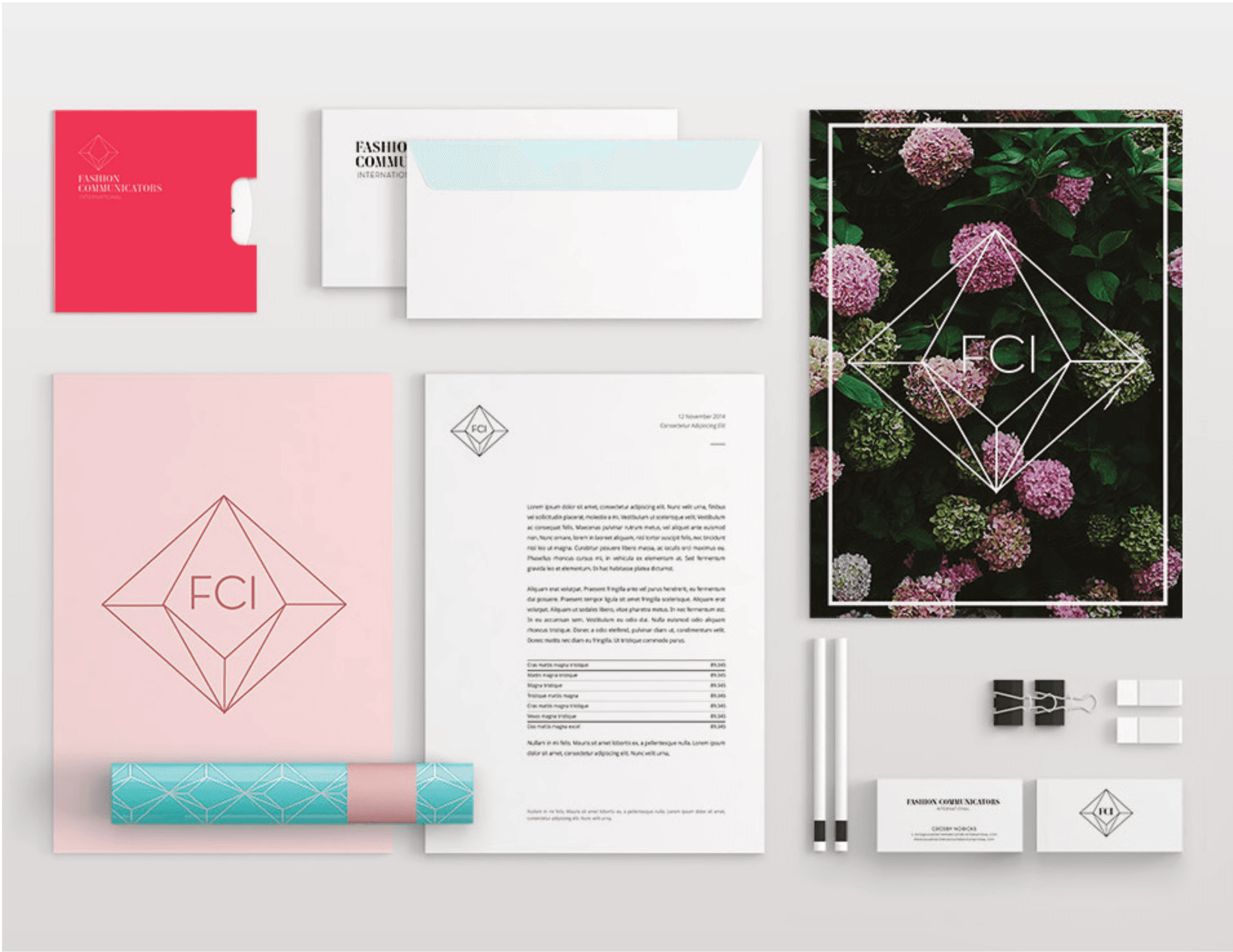
stationery mockups
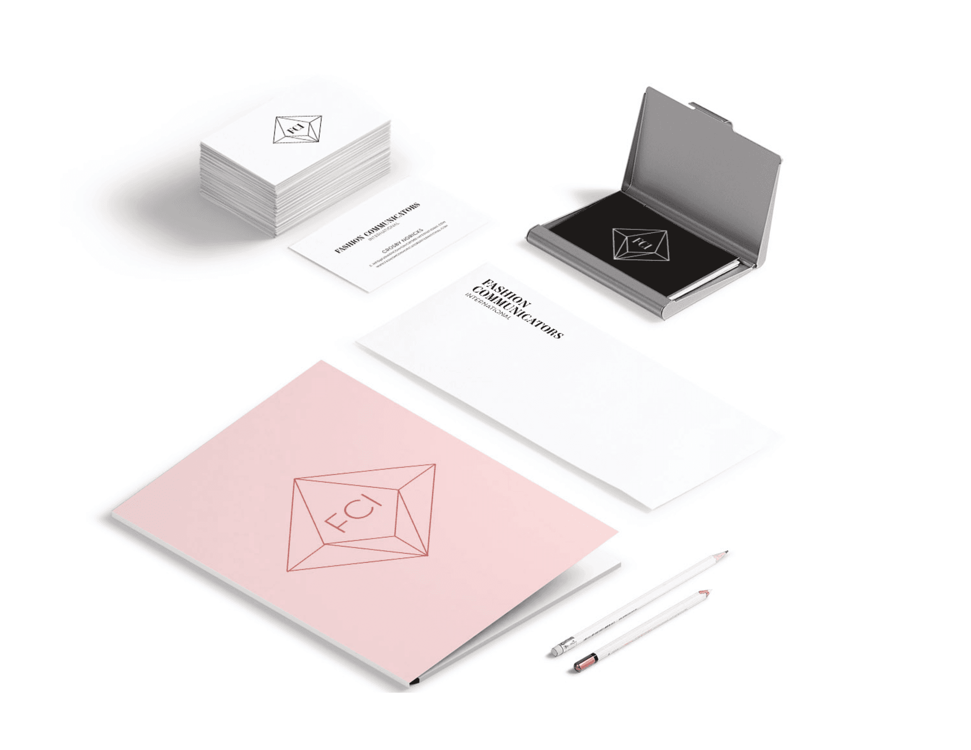
stationery mockups
Learnings
Flexible brand systems require more thought, not less.
There's a common misconception that flexible, adaptable brand systems are easier to design because they're less strict. The opposite is true. Creating a system that maintains consistency while allowing for creative variation requires significantly more strategic thinking than prescribing rigid rules.
I had to identify which elements were essential for recognition and consistency (the logo, the typography structure, the color palette framework) and which elements could vary (specific color combinations, image selection, layout composition). This required understanding not just what the brand should look like, but how it would actually be used by people with different skills, tools, and cultural contexts.
Most brand guidelines are written by designers for designers, assuming professional execution and sophisticated tools. This project forced me to think differently: how do you create a system that works when implemented by someone using PowerPoint on a deadline? That constraint actually made the system stronger because it had to be clear, practical, and robust.
Cultural flexibility isn't about having different regional versions.
The instinct with global brands is to create localized versions: different colors for different regions, different imagery styles for different cultures. But this fragments the brand identity and creates a management nightmare. How do you maintain cohesion when you're essentially running multiple parallel brands?
The FCI solution was subtler: create a diverse visual vocabulary that allows for cultural interpretation within a unified framework. The color palette included enough variety that different regions could emphasize different combinations based on cultural preferences, but all combinations would read as FCI. The photography guidelines celebrated diversity and global fashion influence, meaning imagery from anywhere could feel on-brand if it followed the visual principles.
This approach maintained one cohesive brand identity while allowing it to feel culturally relevant and locally expressed wherever it appeared. Much harder to design, much more effective in practice.
Design systems need to enable, not just control.
Traditional brand guidelines are about control: protecting the brand from misuse, ensuring consistency, preventing visual chaos. There's value in this, but it can also be limiting. When guidelines are overly rigid, people work around them because the system doesn't accommodate their actual needs. Or worse, they follow the rules mechanically and create materials that are technically on-brand but lifeless.
The FCI system was designed to enable. Instead of a long list of "don't do this," the guidelines focused on principles and tools that made good design achievable. The templates provided structure while allowing customization. The color system offered creative freedom within a cohesive framework. The photography guidelines inspired rather than prescribed.
This shift from control to enablement changed how people engaged with the brand. Regional coordinators saw the system as a tool that helped them create better materials, not a set of restrictions they had to navigate around. This positive relationship with the brand guidelines is what kept the system working consistently over time.
Accessibility in brand systems isn't just about compliance.
When I talk about accessibility in this context, I don't mean accessibility in the traditional sense (though the color palette was tested for contrast and readability). I mean accessibility in terms of who can successfully use the brand system. Most brand systems assume access to professional design software, licensed fonts, and design expertise. This creates barriers that prevent many people from implementing the brand correctly.
By choosing free Google Fonts, designing templates that worked in basic tools like Canva and PowerPoint, and providing clear visual examples rather than just written rules, the FCI system was accessible to anyone who needed to create branded materials. This democratization didn't dilute the brand quality. It ensured the brand was actually used consistently because people had the tools they needed to execute it well.
Successful brand systems are adopted, not enforced.
The measure of success for a brand system isn't how beautiful the initial design is. It's whether people actually use it correctly without being monitored or policed. The FCI system succeeded because regional coordinators wanted to use it. It made their work easier, it made their materials look more professional, and it gave them creative flexibility within a clear framework.
I've seen too many brand systems fail because they were designed without considering real-world implementation. Beautiful guidelines that sit on a shelf while people continue doing whatever is easiest with the tools they have. The FCI system was adopted because it was designed for adoption: practical tools, accessible resources, clear principles, and flexibility where it mattered.
The constraint that makes everything clearer:
Early in this project, I asked the FCI leadership team: "If someone sees a piece of your material for three seconds, what needs to be immediately recognizable?" This forced us to identify the essential elements that created brand recognition. Everything else could vary.
This constraint clarified all design decisions. The logo had to be distinctive and flexible. The color palette had to be recognizable even when specific combinations varied. The typography had to establish a consistent tone even when layouts differed. By identifying what absolutely had to be consistent, we created freedom for everything else to be flexible.
This principle applies beyond FCI: understanding what makes a brand recognizable allows you to build flexibility into everything else.