Epokka Notebooks: A Notebook System Designed for Creative Brains

Client
Epokka
Completed
2013-06-18
Overview
Epokka Notebooks began as a personal design challenge born out of a common frustration: creatives often need different kinds of pages—lined, grid, and blank—but traditional notebooks force a choice. Why carry three notebooks when one could do the job?
Overview
I've always been a notebook person. The kind who buys beautiful notebooks and then feels too precious about them to actually use them. Or uses them for a few pages and then abandons them when the project changes. My desk drawer was full of half-used notebooks: one for meeting notes, one for sketching wireframes, one for brainstorming, one for to-do lists. Each served a purpose, but carrying multiple notebooks felt absurd.
The frustration was specific: when I'm working on UX design, I need grid paper for wireframes, lined paper for notes and annotations, and blank pages for visual exploration. But notebooks forced a choice. Grid or lined or blank. Never all three. I'd end up carrying two or three notebooks, or using the "wrong" page type and fighting against it.
One afternoon in 2012, I thought: why doesn't this exist? A notebook that seamlessly combines all three page types in one compact, portable package. Color-coded sections so you can flip directly to what you need. Professional enough for client meetings, functional enough for real creative work.
That question became Epokka Notebooks: a complete product line my partner Koldo and I designed, prototyped, hand-crafted, and launched through Kickstarter. It was my first physical product, my first crowdfunding campaign, and one of the most educational failures of my career. Because here's the thing: Epokka didn't fund. The campaign fell short of its goal, the notebooks never went into mass production, and the business never launched beyond the prototypes.
But calling it a failure misses the point. Epokka taught me more about product design, manufacturing, branding, and entrepreneurship than any successful project could have. It forced me to think like a business owner, not just a designer. And it proved I could take an idea from sketch to physical product in my hands, even if the market validation didn't work out the way I hoped.
Problem
Before designing anything, I needed to validate that this wasn't just my weird personal problem. Maybe other creatives had solved this differently. Maybe the reason multi-type notebooks didn't exist was because nobody actually wanted them.
I started by auditing my own notebook usage for a month. I tracked every time I switched notebooks, every time I wished I had different page types, every frustration with carrying multiple books. The data was clear: I switched between page types constantly, often multiple times in a single work session. Wireframing on grid, taking meeting notes on lined, sketching concepts on blank, then back to grid for layout refinements.
The informal research phase:
I interviewed about twenty creative professionals: designers, writers, illustrators, project managers, entrepreneurs. I asked them about their notebook habits, their frustrations, what they wished existed. The patterns were consistent:
Everyone had developed workarounds. Some bought notebooks with perforated pages and removed sheets to create custom combinations. Others resigned themselves to carrying multiple notebooks. A few avoided paper entirely, working digitally even when they preferred analog thinking.
The features people mentioned most: lay-flat binding (so you can actually use the full page), good paper quality (no bleed-through or ghosting), compact size (fits in a bag without being awkward), and clear visual navigation (easy to find the section you need without flipping through everything).
But here's what surprised me: the people who loved notebooks really loved them. They described their relationship with paper as almost emotional. The right notebook made them feel organized, creative, productive. The wrong notebook felt like friction every time they used it. This wasn't just about function. It was about craft, ritual, and tools that felt good to use.
The market analysis:
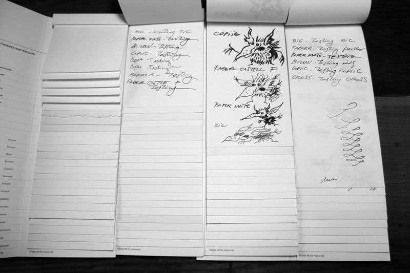
I spent weeks researching existing notebook brands. Moleskine, Leuchtturm1917, Baron Fig, Field Notes, Rhodia. I bought dozens of notebooks and tested them obsessively. I wrote with different pens, sketched with different pencils, tested them for bleed-through with markers and fountain pens.
Most fell into one of two categories: ultra-functional but aesthetically boring (think basic composition notebooks), or beautifully designed but functionally limited (gorgeous leather journals with mediocre paper). Very few balanced both. And absolutely none combined multiple page types in a way that felt intentional rather than gimmicky.
There were a few notebooks that tried. Some had lined pages on one side and blank on the other, which meant you always had the "wrong" page facing you. Others alternated page types throughout, which meant you couldn't keep related notes together. The execution felt like an afterthought, not a core feature.
The core insight:
The problem wasn't that notebooks needed more features. It was that creative work requires mental mode-switching, and your tools should support that transition, not fight against it. When you shift from analytical thinking (taking notes) to visual thinking (sketching), you need different pages. The color-coded sections would become mental cues: "I'm in blue section now, this is structured thinking. I'm in yellow section, this is freeform exploration."
The notebook needed to be a system, not just a product. A tool that adapted to how creative brains actually work.
Solution
The core concept was simple: one notebook, three sections (lined, grid, blank), color-coded edges so you can flip directly to what you need. But turning that concept into a physical product required solving dozens of small problems, each with manufacturing and cost implications I'd never considered as a digital designer.
The paper specification:
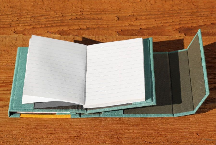
Paper quality was non-negotiable. I'd tested too many beautiful notebooks with terrible paper that bled through or ghosted so badly you could only use one side. I needed paper that could handle fountain pens, markers, and pencil without compromising the reverse side.
After testing about fifteen different paper stocks with various pens and inks, I settled on a 100gsm cream-colored paper. Thick enough to prevent bleed-through, cream-toned to reduce eye strain, smooth enough for comfortable writing but with enough tooth for pencil and ink to grab. The cost was higher than standard notebook paper, but it was the right choice. Tools that work well feel like an investment, not an expense.
The binding system:
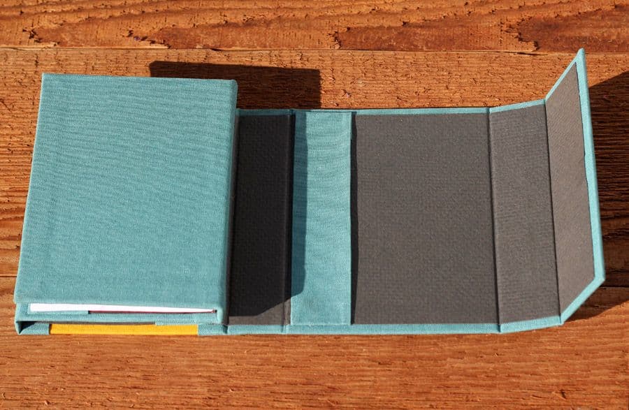
Lay-flat binding was critical but surprisingly complex to achieve. Traditional perfect binding (glued spine) doesn't lay flat. Spiral binding lays flat but feels cheap and catches on things. Stitched binding can lay flat if done correctly, but requires precise folding and stitching techniques.
I worked with a bookbinding consultant to develop a stitched binding using what's called Smyth sewing: signatures (folded sections of pages) are sewn together, then the whole book is case-bound with the cover. This allows the notebook to open completely flat at any page, which is essential when you're sketching or writing near the spine. It also makes the notebook more durable than glued binding.
The cost implication: Smyth sewing is significantly more expensive than perfect binding, which would later impact the final retail price and manufacturing minimums.
The color-coding system:
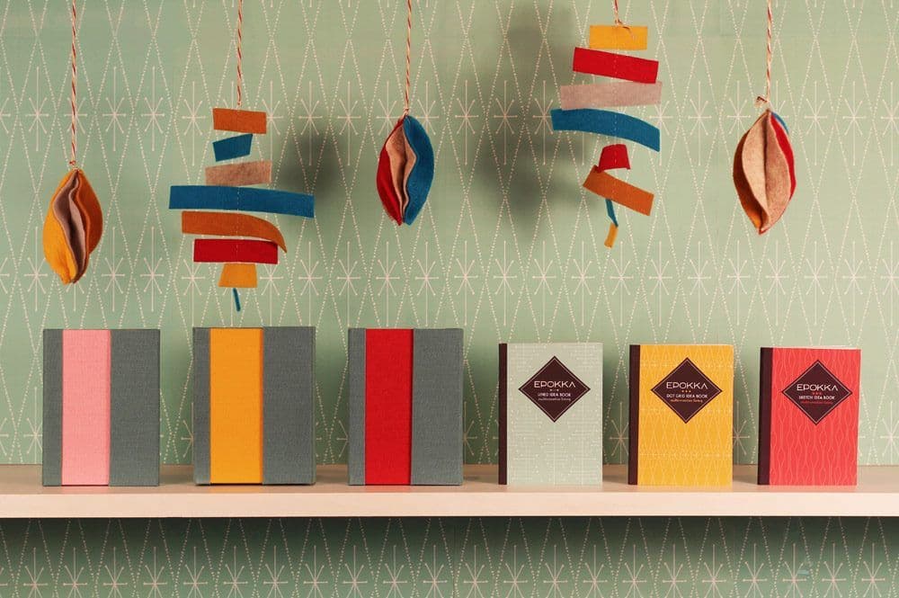
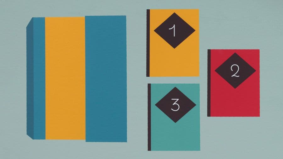
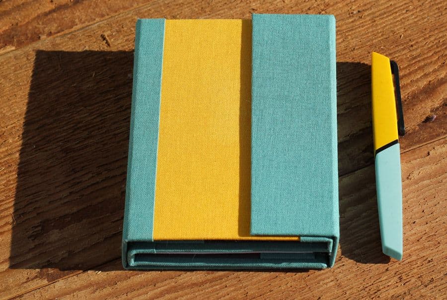
I developed a system where each page type had colored edges: blue for lined, yellow for grid, coral for blank. When the notebook is closed, you see three distinct colored stripes along the edge. You can literally see where each section is without opening the book. Flip to the color you need, and you're in the right section immediately.
This required custom printing and edge painting, another manufacturing complexity I didn't anticipate. Most notebooks have white edges. Colored edges require an additional production step. But the usability improvement was worth it. The color-coding became the signature feature that made Epokka immediately recognizable.
The size and proportion:
I tested multiple sizes. Too small felt cramped for actual work. Too large defeated the portability purpose. I landed on approximately 5"×7.5" (A5-ish), small enough to fit in most bags, large enough to be genuinely useful for sketching and writing. The proportion felt right in the hand, substantial but not bulky.
The page count per section was another balance: too few pages and you'd run out of your preferred type too quickly. Too many and the notebook became thick and unwieldy. I settled on about 40 pages per section (120 pages total), which felt like the sweet spot between usability and portability.
The cover design:
The covers needed personality. While the internal system was about function, the exterior could be about expression. I designed multiple cover options with vibrant illustrations and patterns: geometric shapes, playful characters, botanical elements. The idea was that you could choose the cover that matched your personality while the internal system remained consistent.
The covers were printed on durable cloth material, giving the notebooks a premium tactile quality. They felt good to hold, which mattered for something you'd carry and use daily. I also added subtle debossing for the Epokka logo, a small detail that elevated the perceived quality.
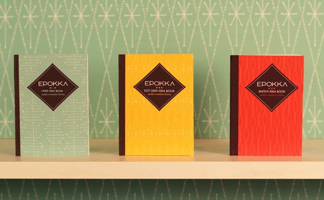
The final product line:
I developed two main products: the "Trio" (all three page types: lined, grid, blank) and the "Duo" (two page types: lined + grid or blank + grid, depending on user preference). The Duo versions acknowledged that not everyone needs all three types, and reducing to two allowed for more pages of each type in the same compact size.

notebook preview campaign
campaign preview
system illustration
demo
Key Insights
The launch day:
The Kickstarter campaign went live on a Tuesday morning in June 2013. We'd spent weeks building anticipation, emailing our list, posting on social media, reaching out to design blogs and influencers. The first day is crucial for Kickstarter campaigns. Strong initial momentum signals to the algorithm that your project is worth promoting to other users.
The first few hours were encouraging. Early backers from my email list pledged immediately, friends shared the campaign, comments rolled in praising the concept and design. By the end of day one, the campaign had raised about $3,000 toward a $15,000 goal. Not explosive, but solid. If the momentum continued, we'd fund.
But it didn't continue. Day two brought fewer backers. Day three, fewer still. The Kickstarter algorithm favors campaigns that are gaining momentum, not losing it. By the end of the first week, it was clear the campaign wouldn't reach its funding goal unless something dramatically changed.
What I learned from the slowdown:
I spent hours analyzing why the momentum stalled. After the campaign ended, I created a detailed post-mortem document analyzing every metric I could track. The numbers told a sobering story.
I'd reached approximately 3,000 people directly through my email list and personal outreach. Of those, only 2% backed the campaign. I contacted 223 press outlets and design blogs. Only 4 featured Epokka (less than 2%). The conversion rates were brutally low.
The backer demographics were interesting though. While 73% of backers were women (compared to Kickstarter's top-funded projects being 71% male-oriented), the audience was highly specific: 52% were designers, 15% were artists. These were exactly the right people. But there weren't enough of them.
The harsh truth: I'd built a product for a niche within a niche. Notebook enthusiasts are already a specific audience. People who want multi-type pages are a subset of that. People willing to pay premium prices for hand-made notebooks are an even smaller subset. And reaching that specific audience with a crowdfunding campaign required marketing resources and reach I didn't have.
The traffic sources revealed another problem. Direct traffic (36%) and Facebook (29%) were my top sources, meaning most people found the campaign through my own promotion. Only 25% came from Kickstarter's discovery features. I wasn't tapping into the platform's organic reach because the campaign wasn't gaining momentum.
This is one of the inherent challenges of launching on a crowded platform like Kickstarter. At any given time, there are thousands of active campaigns competing for attention. Unless you generate immediate momentum, your project gets buried in the feed, pushed down by newer launches and trending campaigns. Kickstarter's algorithm amplifies success: campaigns that are gaining traction get featured, which brings more backers, which creates more traction. But if you don't hit that momentum threshold early, you're essentially invisible to anyone who isn't already following you.
The platform's structure benefits projects that either launch with large existing audiences or go viral quickly. Epokka had neither. It was a good product solving a real problem for a specific audience, but finding that audience required cutting through the noise of hundreds of other design and stationery projects. The campaign essentially became dependent on my own promotional efforts rather than benefiting from Kickstarter's discovery ecosystem.
I also realized I'd underestimated the power of community in crowdfunding. The most successful Kickstarter campaigns tap into existing communities: board game enthusiasts, tech early adopters, sustainable fashion advocates. Epokka was solving a real problem, but it wasn't connected to a passionate, organized community that would rally around it.
The decision point:
Halfway through the campaign, I had to decide whether to push harder (invest more in advertising, reach out to more influencers, create more content) or accept that this wasn't going to fund and learn from the experience. I chose to keep pushing, but my heart wasn't in it anymore. The magic of launching something you believe in had been replaced by the grind of trying to salvage a campaign that wasn't connecting.
The campaign ended having raised about $8,500 of the $15,000 goal, 57% funded. Under Kickstarter's all-or-nothing model, that meant $0. Everyone got refunded. The notebooks would not go into production.
Process
Designing a physical product when you've only ever designed digital experiences is humbling. Every assumption I had about how design works had to be recalibrated for the physical world. Digital design is infinitely malleable until you ship it. Physical products require committing to decisions early, often with financial consequences.
Phase 1: The crude prototypes (Month 1-2)
I started by making terrible notebooks myself. I bought blank notebooks, cut out pages, rebound sections with different page types, and tested whether the concept even worked in practice. These prototypes were ugly and barely functional, but they taught me crucial lessons.
The first prototype had equal amounts of all three page types. I used it for two weeks and discovered I used grid pages twice as often as lined and three times as often as blank. The page allocations needed to match actual usage patterns, not theoretical equality.
I also learned that the color-coding needed to be visible when the book was closed. My first version only had colored tabs on the first page of each section, which you couldn't see without opening the notebook. The edge painting solution came from this frustration.
Phase 2: Learning traditional bookbinding (Month 3-5)
This is where Koldo and I made a decision that would fundamentally shape the project: we decided to learn traditional bookbinding techniques and make the prototypes ourselves by hand. We took workshops, watched countless YouTube tutorials, bought bookbinding tools, and set up a small production area in our apartment.
I learned Coptic stitching, kettle stitching, and various binding methods. I experimented with different folding techniques for the signatures (the folded sections of pages). I figured out how to create the color-coded edges using hand-cut papers in different colors, carefully assembling each section so the edges would show the distinct stripes when closed.
The process was meditative but time-consuming. Each notebook took several hours to create: folding and trimming pages, punching binding holes, stitching the signatures together, attaching the cloth covers, pressing everything flat. I developed my own modified technique that combined elements of Coptic binding with case binding to achieve the lay-flat quality I wanted.
As I made more notebooks, I got faster and the quality improved. But I also started to realize something troubling: the techniques I was using, the modifications I'd made to achieve the specific functionality I wanted, would be extremely difficult to replicate at manufacturing scale. What worked beautifully when made by hand, one at a time, with careful attention to each step, wouldn't translate easily to factory production.
Phase 3: The manufacturing reality (Month 6-7)
With about fifty hand-bound notebooks made in various configurations (Trio vs Duo, different cover designs), we started giving them to friends, colleagues, and other creatives for real-world testing. The feedback was overwhelmingly positive about the functionality.
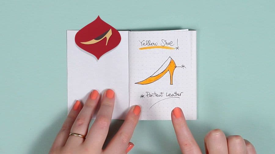
I documented my own usage extensively on our blog. For UX design projects, I'd use two Duo notebooks simultaneously: one dedicated to notes and persona development (using lined pages for structured information about personality types, keywords, goals, and services), and another for diagrams and wireframe sketches (using grid pages for layout work). The system allowed me to capture ideas quickly without getting bogged down in details—when ideas came fast during client sessions or brainstorming, I could sketch loosely and refine later. This became my pitch for how the notebooks worked: they supported the messy, non-linear way creative work actually happens.
But I also started researching what it would take to manufacture these at scale. I contacted bookbinding companies and notebook manufacturers, mostly overseas. The conversations were discouraging. The specific combination of features I'd designed—the multi-section structure with color-coded edges, the modified binding technique, the lay-flat requirement—wasn't standard. It would require custom tooling, high minimum order quantities (often 500-1000 units per variation), and significant per-unit costs.
One manufacturer quoted me prices that would require a retail price of $35-40 per notebook just to break even. Another said they could manufacture something similar, but it wouldn't have the exact color-coding visibility or lay-flat quality of the hand-bound versions. The techniques that made Epokka special were the same techniques that made it difficult to mass-produce affordably.
I had two choices: significantly compromise the design to make it manufacturable, or figure out how to sell hand-made notebooks at a premium price that reflected the labor involved. Neither felt like the right answer, but I'd already invested so much that I decided to move forward with the Kickstarter campaign and see if the market would support the premium positioning.
Phase 4: Brand and campaign development (Month 8-9)
With the physical product finalized, we focused on branding and preparing for the Kickstarter launch. I designed the Epokka logo, chose a playful yet professional visual identity, created product photography, and wrote campaign copy. Koldo and I worked together on planning the launch strategy.
The promotional video became a six-month project in itself, worked on during nights and weekends. We did everything in-house: illustration, photography, animation, and music. It was exhausting but fulfilling—one of those projects where the process felt as important as the outcome. We wanted the video to capture not just what Epokka was, but the philosophy behind it: tools designed for multi-talented creatives who need flexibility in their work.
We created stretch goals and reward tiers. We built an email list of people interested in backing the campaign. Everything pointed toward launch.
The campaign page emphasized the emotional story: tools should adapt to how creative brains work, not force you to adapt to arbitrary constraints. We weren't selling notebooks. We were selling a better way to think on paper.
early prototype
early prototype
testing paper
early prototype
testing ink
Results
Here's what makes talking about Epokka complicated: by traditional metrics, it failed. The Kickstarter didn't fund. The business didn't launch. The notebooks never made it to market beyond the fifty prototypes I had manufactured. If you measure success by revenue or market validation, Epokka was a failure.
But that framing misses so much of what I actually gained from the project.
What I proved to myself:
I took an idea from "why doesn't this exist?" to physical products in my hands. I navigated international manufacturing, negotiated with suppliers, learned about production techniques I'd never heard of before starting. I designed a complete product line with branding, packaging, and marketing materials. I ran a crowdfunding campaign and got real market feedback.
These are skills I couldn't have learned from client work or courses. You only learn physical product development by actually doing it. The notebooks exist. They're real. I still use one of the prototypes. Friends who backed the campaign or received test units still message me occasionally: "I'm still using my Epokka notebook. When are you making more?"
The unexpected value:
Epokka became a powerful case study in product design and entrepreneurship. When I talk to clients about taking creative risks or validating ideas before fully committing, I can point to Epokka as evidence that I understand the challenges firsthand. It gives me credibility in conversations about product-market fit, pricing strategy, and the emotional rollercoaster of launching something new.
It also taught me about my own motivations. I loved the design and manufacturing process. I loved holding a beautifully made object and knowing I'd created it. But I didn't love the constant marketing and community-building required to sell physical products at scale. That realization helped me understand what kind of work energizes me versus what drains me.
The people who resonated:
The backers who supported the campaign weren't just buying notebooks. They were buying into the philosophy behind them. Several sent messages explaining how the color-coding concept perfectly matched how their brain worked. Others appreciated that someone had thought deeply about the creative process and designed a tool to support it.
Those connections, even if they didn't translate to a funded campaign, validated that the problem was real and the solution was meaningful. It just wasn't reaching a large enough audience at the right price point to sustain a business.
What the notebooks taught me about design:
Working in the physical space changed how I think about digital design. Physical objects have weight, texture, smell. They exist in your hand in a way websites never will. But they're also fixed. Once manufactured, you can't iterate quickly. You can't A/B test. Every decision has permanence.
This taught me to appreciate the malleability of digital design while also bringing more intentionality to it. Just because you can change everything doesn't mean you should. Sometimes constraints and commitments lead to better work.
Learnings
Epokka taught me lessons I'm still processing years later. Some were about product design and entrepreneurship. Others were about myself and how I define success.
The biggest lesson: Design for manufacturing from the beginning, or accept you're making art, not products.
The notebooks were good. Everyone who used them agreed. The problem was real, the solution was elegant, the execution was solid. But I'd designed them as a craftsperson, not a product designer. I developed techniques by hand that created exactly the functionality I wanted, without considering whether those techniques could scale to manufacturing.
By the time I fully understood the manufacturing challenges—that my modified binding technique, the specific color-coding method, and the lay-flat requirements would be extremely difficult and expensive to replicate at scale—I'd already made fifty notebooks by hand and built an entire campaign around them. The choice was either compromise the design significantly to make it manufacturable, or accept that these were essentially hand-crafted art objects with a very limited market.
If I were doing this again, I'd talk to manufacturers before finalizing any design decisions. I'd understand the constraints of what can be produced at scale and at what cost, then design within those constraints. Or, I'd accept from the beginning that this is a hand-crafted, limited-run product and position it accordingly with appropriate pricing and market expectations. What doesn't work is designing by hand and then discovering you've created something that can't be scaled.
The second lesson: Passion for the product isn't enough.
I loved designing Epokka. The prototyping phase was some of the most satisfying creative work I've ever done. But passion for making something doesn't automatically translate to passion for selling it. Running a Kickstarter campaign required constant content creation, community engagement, and promotional hustle that felt draining rather than energizing.
This taught me to distinguish between what I love making and what I'm willing to do to bring it to market. Some people thrive on the marketing and community aspects. I learned I'm more energized by the design and problem-solving than the promotion and sales. That's valuable self-knowledge for future projects.
The third lesson: Failure is only failure if you don't learn from it.
For months after the campaign ended, I felt embarrassed about Epokka. It didn't fund. I'd invested time and money into something that didn't work out. Friends and family knew I was launching something, and then... nothing. That felt like public failure.
But the discomfort faded, and perspective replaced it. Epokka gave me skills and confidence I wouldn't have gained otherwise. It's one thing to design digital products where the risk is primarily time. It's another to design physical products where you're negotiating with overseas manufacturers, committing to minimum order quantities, and figuring out logistics and fulfillment. That experience has value, regardless of the outcome.
I also learned that most people aren't judging your failures nearly as harshly as you judge yourself. The friends who knew about Epokka didn't think less of me when it didn't fund. Some even admired that I'd tried something ambitious. The only person holding it against me was me.
What I'd do differently:
I'd consult with manufacturers before making a single notebook. Understanding manufacturing constraints, costs, and MOQs would have shaped the design from the beginning. Maybe I'd have designed a simpler binding system that still achieved lay-flat functionality. Maybe I'd have found a different way to do the color-coding that didn't require hand-assembly of differently colored papers. Or maybe I'd have accepted that this needed to be a small-batch, hand-made product and priced it accordingly from the start ($60-80 instead of $28-32).
I also would have been more honest with myself about what I was actually creating. Was this a scalable product business, or was this a craft project that I wanted to share with the world? Those require completely different approaches, different pricing, different marketing, different expectations. I tried to position hand-crafted notebooks as if they could become a mass-market product, which was never realistic.
And I would have thought harder about the business model beyond the initial launch. Even if Epokka had funded, what came next? Was I going to hand-bind hundreds of notebooks? Hire people to help? Find a way to teach the technique to a manufacturer? I'd been so focused on getting the campaign funded that I hadn't thought deeply about sustainable business operations afterward.
What surprised me:
The emotional attachment people developed to the concept, even without owning the product. Several people who followed the campaign but didn't back it (often citing price) reached out after it ended to say they hoped I'd find a way to make it work because they "believed in the idea." That emotional connection is rare and valuable, even if it didn't translate to sales.
I was also surprised by how much I enjoyed the manufacturing process. Working with physical materials, solving three-dimensional problems, holding the finished product—that tactile satisfaction was different from anything in digital design. It made me appreciate craft in a new way.
The lasting impact:
Epokka changed how I approach all design work now. I think more carefully about manufacturing feasibility in product design projects. I consider pricing and market positioning earlier in the process. I validate assumptions before committing to expensive decisions. And I'm more comfortable with the idea that not everything needs to succeed commercially to be valuable.
The prototypes still exist. I still use one regularly. And occasionally, someone will see it, ask about the color-coded edges, and I get to explain the whole system. The conversation usually ends with: "That's genius. Where can I buy one?" And I have to say, "You can't. But let me tell you what I learned from trying to make it happen."
That story, the lessons embedded in it, and the confidence that comes from attempting something ambitious—that's the real result of Epokka. Not the notebooks themselves, but what they taught me about design, business, and the gap between making something good and making something that succeeds in the market.
Would I do it again, knowing it wouldn't fund? Absolutely. Not because failure is noble or because the journey matters more than the destination. But because some lessons only come from trying, failing, and extracting every possible insight from the experience. Epokka was expensive education, but it was education I couldn't have gotten any other way.
Want to see the data? I created a detailed post-mortem analysis of the Kickstarter campaign with breakdowns of backer demographics, traffic sources, conversion rates, and comparisons to successful campaigns. If you're considering launching a crowdfunding campaign, the numbers might be useful. Download the Epokka Kickstarter Stats report